
Painting this mural project was a huge and very difficult task. It took over two years to complete amid a sea of problems and controversy, funding shortages, bureaucratic ineptitude, a harsh working environment, and great physical discomfort. This is the story of the creation of this mural, named by
Painters and aspiring muralists may consider this narrative
But I believe all will be entertained by the narrative. It's a good story filled with a myriad of characters: a visionary public servant, a group of young, idealistic, and motivated students; a neighborhood wearing of public stereotypical perceptions, individuals wanting to inject their political views into the graphic, apathetic public servants, vocal residents who both praise and malign the story being told, and a very reluctant artist dealing with the issues while cursing every step of the way.
In the end, it's my story; I'm the story teller. So I'm ultimately responsible for all its shortcomings. My memories are colored by my own biases and moods. But time has made me wiser. Since the beginning of the project, I had seven years to ponder its outcome and reach some conclusions. So while not taking the edge off some observations (that's just not my style), I will try to dealt more on the motivations, intentions, and expectations of the participants; not just the outcome. Enjoy.
A final word, you can simply watch the short video at the top of the page to see a brief time-lapse of the project, and you can also dispense with the reading by simply following the sequence of photographs. They are in chronological order and the captions below each image will give you enough information to follow the painting's progression. But if you seek knowledge about the finer details of the craft, as well as a deeper understanding of what really goes on behind the scenes, that is to say
 |
||
|
Muralist |
Weeks before the anticipated completion of the mural, on a very cold and windy autumn day,
 |
||
|
|
Work on the
 |
||
|
The visionary public servant who started it all. |
This public arts project began as a collaboration between
 |
||
|
Computer rendering of the design for the |
Wanting to emulate some of the magnificent public murals done in other cities, Chris and John decided to "raise the bar" -way high, and produce murals of professional quality and content instead of work limited by high school-age student's artistic abilities. To accomplish this goal, a two-phase approach was adopted. For the initial phase, trained student's would complete the "under-paint" stages of the mural, and for the second phase, the artist and professional assistants would do all the finishing touches.
 |
||
|
Computer rendering of the design for |
To prepare the students, John designed and conducted a training curriculum in mural painting. Two groups of fifteen individually selected students from the
 |
||
|
Chris Luciani with students at the |
Funding for the project was primarily provide from outside sources. Chris applied to several grant programs and did all the leg work. He also allocated space at one of the city's recreational centers to host classes for the westside group, and made arrangements with the
 |
||
|
John Rivera-Resto setting up the day's Powerpoint presentation for the west side class. |
In the end, as working arrangements fell apart and the timeline had to be extended, John broke his relationship with the city and completed the mural using the resources of his own company,
The hot summer of 2001 found me perspiring profusely atop a scaffold painting a ceiling mural at the Gordon Square Theater. One morning, before leaving home to work on the project, I got a call from Christopher Luciani. Chris told me he worked for "the city" and had created a program called
 |
||
|
In 2001, John was painting the ceiling of |
I prepared a PowerPoint presentation with a collection of some of my mural works and a few personal photos I felt the kids would find interesting. I know from experience that people are interested in how artists work and make a living as much as they are in seeing their work, if not more. Chris brought about 20 kids with him and we had a good time during their visit. Seeing a mural painting in progress is a fascinating thing to see. The fact that I had started my career when I was not much older than they were generated a lot of questions and really peaked their curiosity. If I did it they could do it too!
 |
||
|
The skills to create traditional "high-end" murals require years of practice and training. Very few schools are dedicated to teaching this ancient art so muralists tend to be self-educated in the craft or former apprentices of professional muralists. |
At the end of the presentation Chris and I had a chance to talk aside for a few minutes about his big dream of creating great mural works around the city. He asked me what would it take for me to get involved in such a venture but I replied that what he was envisioning was professional work that required trained artists, adequate funding, and strong backing at the top to cut through the reams of red tape that you invariably encounter doing public art.
 |
||
|
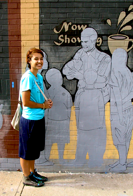
By the time I completed the ceiling mural at the Gordon Square Theater in Cleveland, my hair had grown back to its full length. This photograph was taken at the site a year after the Mural My Neighborhood group site visit, which was followed by the tragic events of September 11, 2001 two months after. There was a sense of pessimism in the air that also affected me. I lost all interest in painting. |
As Chris mentally digested this, I further added that you could not do "high-end murals" with teenagers. It took years of practice to develop the necessary painting skills. But instead of dampening his visionary spirit, he seem invigorated by the challenge. He then retorted: -"If I can get the funding and work out the details, would you be interested?" I stared at him for a few seconds. Then with a slow thoughtful nod I replied: -"I might, we would talk about it then." He smiled from ear to ear, we shook hands, the deal was sealed, and I went up the scaffold to continue painting, perhaps a little sad for Chris knowing how slim his chances were. But call back he did -and it only took him ten years.
It's November of 2011 in Cleveland, Ohio. Winter is about to set in and I couldn't wait till the first week of December to visit my parents on the island of Puerto Rico. This was my yearly pilgrimage to the land of my family and my wife Nancy loved it even more than I. This was our escape from the cold and gray Cleveland weather to the warm and radiant colors of the tropics. We had just celebrated our second wedding anniversary and life was good. It had been a productive year for me with several interesting projects under my belt (see the Artworks by Year page), so until our departure date, I was in a blissful state playing video games, sitting back and enjoying a long rest. That's when Chris called me to schedule a meeting.
 |
||
|
Our initial meeting took place at the |
Chris' office was located in the
 |
||
|
Mural My Neighborhood Program. Mural created by students at the Cudell Recreational Center, Cleveland, Ohio USA, 2006. |
Murals, especially those that follow the narrative tradition perfected by the Italian Renaissance masters, tell stories and have deeper meanings that captivate viewers in an engaging manner. They are beautifully rendered and also serve a decorative function. But the focus of these works is not their artistic value, but rather the subject matter of the narrative they illustrate. Imagery in fact takes a back seat to story telling. This level of cognitive and emotional engagement is what makes them memorable. These murals were created to communicate first but also to delight the eye in the process. That's what great muralists did and this is the kind of art I like to do.
 |
||
|
Mural My Neighborhood Program. Another example of a mural created by students, Cleveland, Ohio, USA. |
After telling me more about the Mural my Neiborhood highlights, Chris opened his desk drawer and pulled out a few color copies of murals done in other cities in the United States. As he showed them to me he talked about what he particularly enjoyed from each mural. I listened with interest while pondering where the conversation was heading though I could make a good guess. It was obvious he wanted to take the Mural my Neiborhood a step further, but I knew this was not going to happen without a new approach for the program.
 |
||
|
|
Public murals done in other cities, especially many prominent ones done in Philadelphia or Los Angeles, were run through local government programs or business support, and had been done by experienced professional artists, not by inexperienced amateurs. But I have discovered that many people believe that a child whose work is prominently displayed on the kitchen's refrigerator make them instant Michelangelos. They are clueless of what it takes to do a large scale painting, the cost, the discipline, the hard work and the dangers of working high above the ground.
.png) |
||
|
|
I listened patiently until Chris finally made his proposal: he wanted me to be in charge of the projects for 2012. He wanted to replicate what other cities had done. His idea was to do two memorable murals for the season, one on Cleveland's east side and one on the west side part of town. In preparation he had already secured a couple of grants to cover expenses and artist's fee. He would also use other resources available to him through the city's recreation department, such as classroom space, some art supplies as well as adult supervisors already employed by the rec centers. The students would be paid through another non-profit youth employment program called
 |
||
|
The student's parents were invited to a meeting at Cudell to discuss the program. Sixteen students were enrolled for the west side group and we wanted the parents to know what we intended to do. This was important because all the students were teenagers, the youngest being thirteen years old. The response was very positive and I got to know some of them well during the course of the project. |
All this sounded good -in theory, but the monies from the grants amounted to less then what it would take to paint even one mural. At this stage there was not even an idea of what the murals would look like, or walls to paint them on, so there was no way to accurately make a cost estimate. But based on what had been done before, I was pretty sure the numbers wouldn't add up. For the kind of murals that had been done before, the resources sounded lavish by comparison, but for the type of murals we were envisioning, it was woefully inadequate.
 |
||
|
The "east side" class learning how to do a "grid" drawing. The students were taught the skills needed to do the first half of the painting process: equipment and material setup and handling, safety, wall preparation, design transfer, and the application of base colors. |
But what made me even more hesitant was the idea of working with teenagers. I had done that before (see
 |
||
|
In addition to drawing and painting exercises, the students were taught basic art theory (color, perspective, optics) and given a historical background on mural painting. |
Secondly, maintaining good discipline is a problem. For me a job is a deadline to be met and the finished product has to look great. For youngsters, painting a mural it's a fun summer "arts and crafts" group project with emphasis on having fun, which leads to not being able to accomplish much. And in the age of cell phones, you are lucky if you get five minutes of work before they are texting for ten. Thirdly, even if they had any experiences painting canvases, this is basically useless when painting on a large scale. Bottom line, teenagers are not trained or experienced painters so their usefulness is very limited to me. To put it in even blunter terms: a group of teenagers on a professional mural site is a hindrance.
 |
||
|
Before the design was conceived, Chris had been searching for a wall. When you mention teenagers and painting, property owners think graffiti. So it took a while to find the right wall and negotiate with the owner to allow the use of wall. |
You probably think I'm a pessimist at best or a heartless bastard at worse, denying young minds the opportunity to develop and nurture their innate god-given artistic talent. That I should have more faith in the youth of tomorrow and that I may learn a thing or two from the experience, like having more empathy for the potential geniuses of the future (because one never knows), and so forth. I heard all that rot from well-meaning people who have not a clue about mural painting. So I will put you in my position by explaining things in a way you can easily understand: Imagine you have to undergo brain surgery. Now, would you let a group of teenagers assist the surgeon operating on your brain just because they know how to apply band aids? I rest my case.
 |
||
|
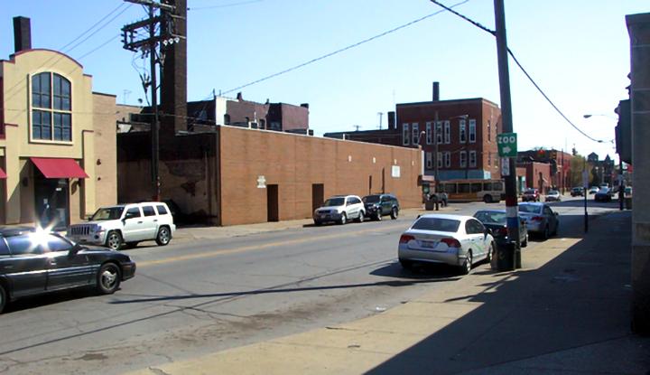
Chris secured a wall at a prime location on the corner of Clark Avenue and West 25th Street on Cleveland's west side. It was almost 2000 square foot -18 feet high -a street block. The wall was a recent brick facade construction that joined several buildings that served as doctor's offices into one single complex. But it was not perfect. I had two working entrances going through them. |
I explained my reasoning to Chris and made a few suggestions on how to tweak on the program's achievement to streamline some areas on the painting process. My intention was to wish him luck and move on. I told him he could call me at anytime for consultation on any other issue. But Chris would not be dissuade that easily. He lean back on his chair, took a few seconds to organize his thoughts, and then said:
 |
||
|
On |
I was hooked, but I did not dive into a full commitment just there and then. I responded:
Same as any complex task, painting murals requires careful planning and preparation. It is a progression of steps where each step builds upon the previous one until one reaches the end. These steps are not something that begin when you paint a mural. They were in fact started thousands of years before at the dawn of civilization and we muralists have been climbing them ever since. This is so because mural painting is a derivative process, which builds upon the advancements, methods and techniques of previous painters who labored on the caves of Altamira, the streets of Babylon, the tombs of Egypt, the great temples of Greece and Rome, to the magnificent palaces of the Italian Renaissance. There is nothing in mural painting today that has not been done before. What we do today is to simply tell the same stories in a different way.
 |
||
|
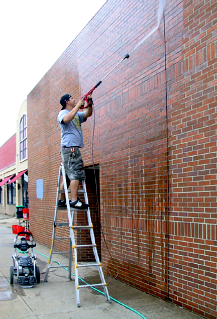
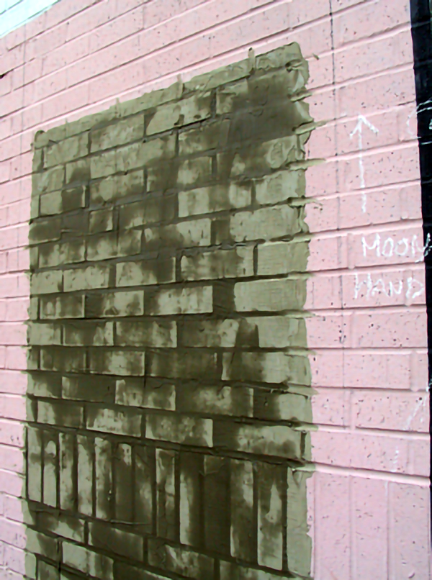
Bricks surfaces vary greatly from smooth to rough to pitted. A smooth surface would had been ideal to paint the mural, but the brick used to build the wall was the pitted kind. This presented a major problem, which was, pitted brick eats brush bristles like sandpaper. Also, it takes more paint to achieve an uniform surface on this type of brick. |
Each generation of mural painters create stories according to the perspective of their time. This keeps the telling fresh, alive and relevant to new audiences. But mural painting methods and techniques have hardly change at all. The process for planing and executing a mural is still the same as the first ones done in antiquity. First, you visualize your mural design by creating a rendering called "a cartoon". This is your blueprint for the finished mural. Then you find a suitable location for the mural and erect ladders or scaffolds to reach the entire wall.
 |
||
|
Materials and equipment were kept in a storage pod. Water buckets were filled every morning at a sink in the employee lounge inside the building since there was no other suitable tap to attach a hose. The average water consumption was five buckets a day. |
Next, the wall is washed to remove impurities and loose material, and a coating of a primer color is applied to seal the surface and make it uniform. Once the wall has been prepared -"prep", the cartoon is transferred to scale on the wall through one of various methods. Finally, the designed is painted by first blocking large areas of color and then detailing them with different brush sizes. Lastly, a clear protective finished may be applied to extend the life of the mural.
 |
||
|
Chip brushes or "China brushes" have natural China bristles (hog hairs from China), with wood handles set in epoxy. They are not meant for painting, but for dusting, cleaning, or for applying stains, solvents or glues. But they can also be an inexpensive and expendable solution to the application of primers and base under-paint. |
Note: This Page is still under construction. The narrative will be continued in upcoming updates.
 |
||
|
July 19, 2012. Students begin priming the brick wall. |
text
 |
||
|
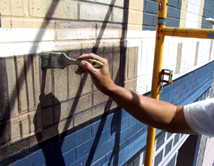
Primer was applied using heavy rollers and brushes. A team of students worked the ground level, and two other teams work the middle and top of the wall from a scaffold. Another team kept them supplied and helped move the scaffold along. |
text
 |
||
|
Teenagers had fun working in small groups. Some got creative. Others liked waving at every passing car who never fail to beep the horns. As time went by, the beeping got out of hand as drivers expected to be acknowledge with a thumbs up or they would get mad. So John assigned a student to smile and wave back and give them the thumbs up. |
text
 |
||
|
Looking down from atop a scaffold can be unnerving to some with fear of heights. |
text
 |
||
|
|
text
 |
||
|
Work progressed in slow methodical fashion. Virgin brick absorbs a lot of paint and the heat dries up the outer bristles of a brush. This makes brush work harder so the bristles have to be rinsed clean every 15 minutes. Notice student with sun hat waving at traffic. |
text
 |
||
|
|
text
 |
||
|
Wall priming was completed on the second day of work. This was the easiest part of the project but an important one. It allowed the students the opportunity to put into practice what they had trained for and also help make adjustments to the daily work process. |
text
 |
||
|
Three levels of tower scaffolding were assembled and taken apart for storage each day. The planks were 9-feet long. Doing this task was the equivalent of lifting weights twice daily, every day of work. At the end of the day, muscle-sore and tired, everyone dreaded taking the cumbersome construct apart. |
text
 |
||
|
Thalia Fomby, 15. |
text
 |
||
|
Yanna Morgan, 16. |
text
 |
||
|
Jacob Buntyn, 15. |
text
 |
||
|
Amanda Maldonado, 16. |
text
 |
||
|
Joshua Serrano, 17. |
text
 |
||
|
Thalia and Shamyra "Peaches" Johnson, 15. |
text
 |
||
|
Gabriel Pichardo, 14. |
text
 |
||
|
Margaux May, 14. |
text
 |
||
|
Chamar Bright, 15. |
text
 |
||
|
Victoria Velez, 17. |
text
 |
||
|
Ric Owens was my 'Sergeant-at-Arms', making sure everyone was following site and safety protocols. Teenagers have a habit of wondering off as soon as they feel like taking a break (which happens a lot). Ric made sure he knew where everyone was at all times and herded back those who wandered off. |
text
 |
||
|
|
text
 |
||
|
The next stage after |
text
 |
||
|
Measurements diagram made from the gridded design rendering. This was then reproduced to scale on the wall by the apprentices. |
text
 |
||
|
Carpenter and water levels were used to assure the perfect alignment of all vertical and horizontal lines. Shapes were drawn with rulers and chalk. Large areas were then contoured with masking tape for painting. |
text
 |
||
|
Paints were supplied by |
text
 |
||
|
The second phase of the project was marking large shapes for coloring -a process we call |
text
 |
||
|
Once sections were drawn on the wall -such as the panels in this particular door, they are |
text
 |
||
|
|
text
 |
||
|
In spite of it's simplicity, this part of the job goes on at a slower pace as each section is checked and double checked to make sure the lines are accurate to the inch and perfectly straight and leveled. The successful placement of subsequent layers and elements depends on the perfection of this stage. |
text
 |
||
|
|
text
 |
||
|
I only worked 3 days a week at this location. For the next 3 days I moved to the east side mural location to work with the second group of apprentices. See |
text
 |
||
|
|
text
 |
||
|
|
text
 |
||
|
An unexpected discovery was seeing how good the wall looked in the storefront glass reflection across the street. |
text
 |
||
|
The next step was to add layers of architectural detail one building at a time. The wall's bricks were incorporated as far as posible into the painting. |
text
 |
||
|
Detail of the painted cornice on building-1. A cornice is the horizontal decorative molding that crowns a building, the top or a door or a window. Painting was generally done top to bottom to avoid paint drips falling of finished areas. Due to strongs winds, paint splatter is an inconvenience of outdoor painting. |
text
 |
||
|
The bricks were painted with slight tonal variations that added richness to the architecture. The design called for each building to have its own personality and to represent the pulse of the community across a timeline. Paints used on successive layers were mixed from the base colors on design palette and packed in sealed plastic containers. |
text
 |
||
|
After the bricks were painted in tonal variations, they were further "distressed" -made to look weathered and aged, using thin washes of paint. Chip brushes proved to be ideal for this job. The brick surface "shaved" the brush bristles away quickly. But we had bought these brushes by the dozen for less than a dollar each. They really helped us stay within budget all the way to the end of the project. |
text
 |
||
|
While the brick on building-1 was being painted and distressed, apprentice Amanda Maldonado worked on the storefront's bulkhead (that's the area below the display windows). She volunteered her time after school and demonstrated great skill and patience for painting outlines. Panels of dense foam were used to sit or kneel on while working on near the ground sections. |
text
 |
||
|
Detail of brickwork and storefront's bulkhead panels. Later on, I decided to redo the bulkhead with another design that added a richer layer to the painted narrative. This was one of those rare instances when I make changes to a design. |
text
 |
||
|
Corbels (brackets to carry weight) being painted to "support" the heavy window sills. Eventhough these are painted architectural elements, we treat them as the real thing. In fact, all our architectural references came from existing buildings in the area. |
text
 |
||
|
Detail of a finished corbel. The painting of many elements had to be simplified so that they would give an illusion of reality without having to paint much detail. This was necessary because the brick lines destroyed the illusion when the scale of the details was too small. |
text
 |
||
|
Building-1 was looking fantastic. The shadows casts by street light poles added another level of realism. |
text
 |
||
|
|
text
 |
||
|
Since the student apprentices have left and returned to school, a few volunteers came in to fill the gaps. One of them was Craig Wilson, a tatoo artist with a permanent smile and a sunny disposition. Ric Owens was the only paid assistant during the entire project on both mural locations and he proved to be invaluable. Chris Luciani would also show up at the end of the day to help us disassemble the heavy scaffold, a taxing job for only two people. |
text
 |
||
|
The process for painting images on a brick wall: 1- The wall surface is washed with non-wax detergent |
 |
||
|
2- The wall is sealed and made uniform with a coating of primer. This reduces porosity and makes paint adhere better to the surface. Next, one or two coats of monochromatic paint (under-paint) is applied as needed. This paint layer will serve as a base base for later layers. |
 |
||
|
3- A line drawing of an image is rendered on sturdy paper, such as "butcher paper" or kraft paper. In mural painting this is called "a cartoon". A series of cartoons are linked to create a composition. Illustration, drawing, layout, or design are terms sometimes used instead of cartoon. |
 |
||
|
4- Chalk is rubbed on the back of the cartoon. The color of the chalk should contrast from the base color. The cartoon is placed on the wall and secured with masking tape. Additional pieces of tape are place parallel to the outer edges of the paper. |
 |
||
|
5- "Registers" are added. A register consists of a continues line made with a permanent marker that crosses the cartoon to the parallel tape pieces along the edge of the paper. At circle or any simple marking is added at each ends of the line for easy identification. |
 |
||
|
6- The outer contour of the image (shown in red) is traced over with a hard pencil. This is done to transfer the shape of the image to the wall. A hard pencil is used to be able to trace hard enough so that a chalk marking (from the chalk residue rubbed on the back of the cartoon) leaves a tracing on the wall. |
 |
||
|
7- The cartoon is removed but the "register tapes" stay on the wall. Depending on the size or shape of the cartoon, any number of registers can be added during the previous step. A chalk tracing of the image shape will be clearly visible on the wall. |
 |
||
|
8- A mortar mix (made of water, sand and Portland cement or lime) is applied to the brick lines within the image contour to "level" or even out the painting surface. Brick lines create a channel that, when accentuated by sunlight, distort and "overpower" small scale images painted on a wall. A solution is to fill the channels with mortar to create a more even surface. The filler is blended smooth into the brick lines once the image area is leveled. |
 |
||
|
9- Once the filler mortar dries, the area can be smoothed further by rubbing it with a straight edge such as a metal spatula. The image shape is painted with the appropriate monochrome color paint. This base coat serves as "under-paint" for the image to be painted. |
 |
||
|
10- A second coat of paint can be added to achieve a desired color opacity. The areas around the shape are then retouched with the wall's base color. |
 |
||
|
11- The cartoon is repositioned on the wall making sure the registers align perfectly. Then the rest of the image is traced with a hard pencil. |
 |
||
|
12- The cartoon is removed, leaving a chalk tracing of the image over the colored shape. Depending on the kind of image being created, painting can be done over the chalk drawing. But for the most part, the drawing is "inked", that is, make permanent by redrawing the chalk-lines with fluid paint that has been thinned with water. This will make the drawing permanent and impervious to bad weather (a rain shower, for example, will erase the chalk). |
 |
||
|
13- The image is then painted in monochromatic colors (solid base colors) as required, taking care to stay within the contours of the drawing. Note that the register tapes also remain on the wall. Invariably, it may become necessary to reposition the cartoon to trace a detail that may have been lost in the painting. |
 |
||
|
14- After the base colors have dried, other thin paint layers are applied rendering flat shapes into light and shadow forms. The mixes are generally a darker and a lighter mix of the base colors, accomplished by adding a dark color and a white color to the base. |
 |
||
|
15- The image is completed by adding cast shadows and reflected highlights. A clear non-yellowing synthetic varnish is applied to protect the thin paint layers on the painting. Several coatings of the varnish may be applied to achieve the desired surface protection. A satin finish (less gloss) tends to work best on the finished art. |
 |
||
|
On our final day on location for 2012, I did a figure painting test on the wall. I could get away with painting simple architectural details on brick, but painting figures and face details over the brick lines would have been a taxing waste of time. So I brought along a cartoon of |
text
 |
||
|
On location, chalk was rubbed on the back of the paper, then the cartoon was positioned on the correct grid coordinates, and secured with tape. Registers were added and then contour of the image was traced on the wall. |
text
 |
||
|
The cartoon is removed leaving behind a chalk tracing of the image's contour. |
text
 |
||
|
We prepared two mortar mixes to try on the wall. One was a basic mortar mix and the other was one was a latex emulsion formula. |
text
 |
||
|
Mortar was applied to the brick lines with a spatula and allowed to dry. |
text
 |
||
|
At this point we discovered that the bricks were too uneven to provide a flat surface. Some stuck out the wall more than others so we decided to add more filler in an attempt to better level the surface. |
text
 |
||
|
After the filler dried, Ric applied a coating of the base color. |
text
 |
||
|
Other areas were painted accordingly. Notice the register tape in this image. |
text
 |
||
|
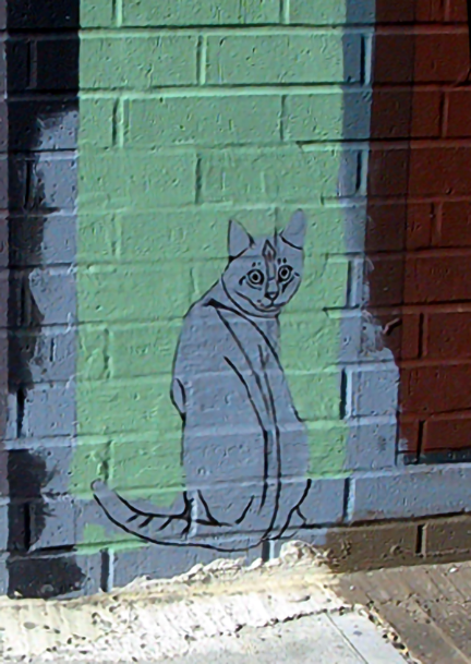
The cartoon was repositioned and the drawing was traced and inked. Then the cartoon of the cat was traced in position. |
text
 |
||
|
Notice the guidelines set 12 inches (30.5cm) apart on the cat's cartoon. They corresponded to the gridlines on the design. This allowed for the perfect placement of images on the wall. Each cartoon was mark with the corresponding coordinates on the grid. |
text
 |
||
|
With a reference image of the figure taped to the wall, I proceeded to quickly paint the image. The brick surface was warm, paint was thin and it dried fast. |
text
 |
||
|
The cat image was painted in the same manner. Notice the pitted texture of the brick. |
text
 |
||
|
After an hour of work, I stopped the test. It had been very useful. We discovered that regular mortar worked best since the one with the latex additive, while it stuck well to the wall, made painting more difficult since it demanded a more opaque paint. Also, the filler from both mixes shrank when it dried so the brick lines were still noticeable. And lastly, in spite of the heavy primer and the base coating of paint, the wall was still very absorbent. So blending colors was going to be very difficult. |
text
 |
||
|
September 2013 -a year later. The image of the lonely girl and her cat were finished after finding solutions to the problems with the brick and the mortar. |
text
text
 |
||
|
|
 |
||
|
The beginning of every project begins with a list of the needed supplies, materials, and equipment. Working on location demands preparation and organization. You want the convenience of having everything at hand when needed. |
text
 |
||
|
Another storage pod was secured for the second season on the project -summer and fall of 2013. All our supplies and equipment were stored here. The storage pod was placed at an alley next to the building. Equipment that I felt was too expensive to risk the chance of being stolen from the pod, stayed secured in my van. During working hours, the alley was closed to regular traffic with safety cones but our personal vehicles were parked within. |
text
 |
||
|
I kept on my person all the items I could not risk leaving behind: the keys to my van and the pod, my wallet and watch, and my cell phone. These I would tie atop the scaffold when painting, and around my neck at any other time. Other indispensable gear were a sun hat, sunshades with UV filter, and ear muffler to block the infernal street noise. |
text
 |
||
|
I decided to begin with building-6, the one nearest to the major intersection of Clark Avenue and West 25th Street. This corner was a dangerous spot because of the heavy traffic and the way some drivers ignored every traffic law while turning the corner. So I wanted to get it done fast during the best weather. In addition, it would give the public something positive to look at. |
text
 |
||
|
I would spend my days painting the mural, and my evenings at my shop drawing cartoons of every image element and figure on the design. By the end of the project, I had done over 200. The process begins by squaring the paper into 12 inches (30.5cm) squares, marking the squares with the corresponding number coordinates on the design (which was previously squared in a smaller scale of 3/8" -0.375), and then drawing the images guided by the position of the squares. For large size cartoons, paper sheets are joined with masking tape. Once done, you roll up the cartoon, write an identification inscription on it, and continue the process night after night. |
text
 |
||
|
|
text
 |
||
|
On this same day, the contours of all the figures groups on bulding 6 were traced and inked. This was a priority so that the time consuming concrete rendering over brick lines could be done and allowed to cure while I worked on the first figures. |
text
 |
||
|
Once the concrete dried, the shapes within the contours were treated with two coatings of concrete mix to cover the worse of the brick lines. When the mix dried, one or two coats of primer gray tinted primer were applied. After the primer had cured, the cartoon was re-attached to the wall making sure the registers matched, and the entire drawing was traced. Then the chalk drawing was inked with fluid paint. After the ink dried, a moist cloth was used to clean up the chalk residue. |
text
 |
||
|
The background was painted first, taking care to brush along the figure's contour lines and not across them. Maintaining a precise drawing is key to this style of painting. |
text
 |
||
|
The figures were painted in the traditional monochromatic manner: starting with a base color and then adding layers for lights and shadows. Brick and concrete retain the heat of the sun. With temperatures in the 80s and 90s, they got oven hot. This makes color blending very difficult as paint dries fast and, because of the porosity of the surface, absorption was uneven and some blended areas looked blotchy. So the key to painting under these conditions was to apply the paint in a more impressionistic and stylized style. Since the paint dries very fast, you keep your mixes as fluid as possible and work fast, but painting highlights with a more opaque mix. |
text
 |
||
|
Having a limited paint palette helped with overall color consistency on the entire mural. Notice how sunlight sharply highlights the brick lines. This was a distraction, especially on bright sunny days. So covering the lines with concrete over the image areas helped the finished image stand out from the rest of the wall. Also, painting in a simple style with bold strokes, accentuated the images and minimizes the overpowering effect of the brick lines. |
text
 |
||
|
Painting the floor area completed this scene. To add to the three-dimensional quality of the figures, that is, to make them appear as if they were really standing on the side walk, all the buildings were painted at a 90-percent scale, allowing for a section of sidewalk to be painted across the bottom of the composition. When seen from a distances, the painted sidewalk blended optically with the real sidewalk and this effect made it appear as if the figures were actually standing on the actual sidewalk and several inches away from the wall. |
text
 |
||
|
While I worked on the paintings, Ric did all the cartoon contour layouts and concrete work. This tedious work that requires precision and consistency. |
text
 |
||
|
The second grouping of figures is ready for painting. Notice the blue register tapes on the wall. For large size cartoons we placed a larger number of registers. The concrete residue over the surrounding background is wiped clean with a moist cloth or a sponge. This does not eliminate it all since the brick absorbs part of the cement. So the cleaning is just to remove loose residue which is mostly powder. But since the background color is only "under-paint" that will be painted over again, the residue stain is not a problem. |
text
 |
||
|
Close-up detail of the wall. Notice the rough texture of the painting surface. While the concrete mix fills the worse of the brick lines, because of shrinkage as the concrete dries, they still remain visible. In addition, baked bricks are never perfect and it's impossible to perfectly align bricks when building a wall, so some stood out from the wall making the surface unlevel. Therefore, a second coating of concrete was then applied on the worst areas but this was kept to a minimum, because to make the surface perfectly smooth, the concrete layer would have to be at least 1/4" (0.66cm) thick. But since I wanted the painting surface to be as level as possible, we opted for simply "dulling" the depth of the brick lines so they would be less visible. |
text
 |
||
|
We use inexpensive color chalk sticks, also known as sidewalk chalk, to rub on the back of the cartoon paper to make our transfers. The advantage of using chalk over graphite or carbon transfer sheets is that the chalk leaves no oily residue. For transferring small or intricate detail images (or on other surfaces such as glass), we use |
text
 |
||
|
Detail of chalk transfer. The cartoon is never entirely removed until we make sure the entirety of the image has been traced. |
text
 |
||
|
|
text
 |
||
|
While I worked inking this group of figures, Ric and Amanda worked on the next set. Notice the tape registers still in place in case we needed to retrace any part of the cartoon. |
text
 |
||
|
After inking the figures, the background color was reworked. A reference black and white image was always taped on the wall for easy viewing. |
text
 |
||
|
|
text
 |
||
|
|
text
 |
||
|
|
text
 |
||
|
|
text
 |
||
|
Ric was very proud of his work completing the groundwork of the lower figures on building-6. By now he had become the project's "concrete expert". |
text
 |
||
|
|
text
 |
||
|
|
text
 |
||
|
Back to |
text
 |
||
|
Over the base colors on the face and hair, I proceeded to model it beginning with highlights. |
text
 |
||
|
After the highlights, I blended in the shadows and accentuated the lines. For this mural, I had decided to use a simpler style of painting, more lineal than painterly -more Botticelli than da Vinci, which would be easier to teach to apprentices. The student apprentices never got to this stage, but in the end, I completely adopted it because it allowed me to paint fast and because it proved extremely difficult to do proper tonal blendings on the hot and porous wall. |
text
 |
||
|
After finishing the face, I proceeded to wash a layer fluid color over the uniform. This served as my base color. |
text
 |
||
|
Same as before, I modeled the uniform in monochromatic colors (blue base, light blue and dark blue). Then I accentuated the darks to bring up the constrast. |
text
 |
||
|
|
text
 |
||
|
When creating the design, I made sure the ball was prominently displayed. It represents Cleveland's major religion: football -that's "American football" to the rest of the world. And, every fan knows that the dog symbol on the ball represents the Cleveland Browns. |
text
 |
||
|
Ric had begun working the concrete rendering on the top figure groups on August 2, immediately after completing the lower ones. By the 6th of the month, the four groups had been finished and primed. Amanda had assisted him with the cartoon layouts. By now she was our "tracing expert". For this season we acquired a scaffold with 6-foot platforms instead of the 9-foot ones of the year before. With less hands on the job, lighter platforms were easier to handle. |
text
 |
||
|
Leveling the scaffold for stability on a sloped sidewalk -as seen on this photograph, was extremely important. To be able to do so, each leg was equiped with wheel jacks that allowed for individual adjustments. So our first order of business was to level the base section on the day's working spot before adding other sections to work on. |
text
 |
||
|
A tubular scaffold 24" (61cm) solid stem socket jack and wheel. They are heavy but indispensable for working on uneven ground. |
text
 |
||
|
Detail of top group figures on building-6. The brickwork on this section of the wall took time because it was more uneven. |
text
 |
||
|
|
text
 |
||
|
Weeds will grow anywhere, including the crevices between the brick wall and the sidewalk. We cleared them out when we prepped the wall, but it was a matter of time before they would showed up again. Like in many other public art projects I have been involved with, there had been no talk of maintenance at all during our planning stage. This is the reason why many pieces of public art are covered in weeds and why many other mediocre projects get funded: they require no maintenance, and consequently, no mounting expenses. So we took matters into our own hands and filled the entire crevice with a sealer (that would eventually be painted over). |
Lettering
 |
||
|
Lettering was traced in the same manner as the figures. Since they were larger in scale, no concrete rendering on the brick was necessary to make them legible. The letters were then painted by Amanda with two coats of color (needed to achieve full opacity with light color paints), and then I "cut" them clean by outlining the surrounding background. Then assistants filled in the remaining negative areas in the background. By using this method, less skilled painters can work fast without having to worry about "messing up". |
text
 |
||
|
It was far easier to paint letters and graphics the way I described it in the previous caption |
text
 |
||
|
|
text
 |
||
|
Having assistants do monochrome painting or base-color under-painting meant that I could dedicate my time to paint modelling in other areas. This had been my plan all along. This is the kind of job relegated to apprentices until through practice and experience they develop the necessary skills to do paint modelling. |
text
 |
||
|
|
text
 |
||
|
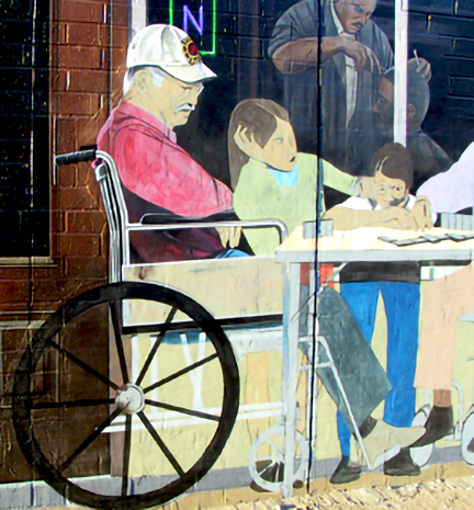
This mural was a first in many ways. It portrayed a very dignified elderly European couple showing empathy for the needy, African immigrants contributing to the community, an inspirational "traditionally built" lady, Asian, Hispanic, Caucasian and Middle Eastern children, a white police office in a loving and positive role, a single mother happily dancing with her daughter, a caring housewife cleaning windows, a grandfather helping his grandson with his reading, and this was just on one building! And on the adjoining building it showed happy and productive citizens in wheel chairs, and the list goes on! They are the type of people you seldom see portrayed in public art. |
text
 |
||
|
|
rrr
 |
||
|
The elderly European couple were next. How do you know this cool lady is European and not an American -though maybe she is a recent immigrant? I'll let you figure it out. |
eee
 |
||
|
Work progress as of August 13, 2013. By this point in the project, we were getting a lot of attention. At long last the public was getting a glimpse of what to expect. |
ttt
 |
||
|
|
yyy
 |
||
|
After Amanda painted the poster in solid colors, I did the black outlining. As a trained sign painter, it was relatively easy for me to freehand the outline. |
uuu
 |
||
|
Modelling the face of the |
iii
 |
||
|
A police office and his partner stopped by for a look-see. He was happy to pose for a photo of his uniform. I desperately needed an image of the Cleveland Police patch. |
ooo
 |
||
|
|
text
 |
||
|
|
666
 |
||
|
The elderly couple slowly heading to the food drive table. They carry a basket of food donations. It took longer to decided what to put inside the basket than it did painting it. |
666
 |
||
|
The cast shadows from street lighting falling onto the mural added a surprising sense of realism to the scene. |
777
 |
||
|
|
888
 |
||
|
Just before finishing the day, a man drove by and stopped by the mural. He got out and pointed up with a happy grin. Then he told us that he had a dog identical to the one I painted on the window, and that he was telling everyone that "that" was his dog! I was happy to make his day. From that day on we referred to him as -"el chillo", Puerto Rican slang meaning: the lady's lover! We spent so much time with these fictional characters on the wall, that the lines between real and illusion were beginning to blur. |
888
 |
||
|
Ric had already moved to building 5 while I was working the window figures on building-6. |
888
 |
||
|
|
xxx
 |
||
|
|
xxx
 |
||
|
On some weekends like this day, my lovely wife Nancy volunteered to give us a helping hand. She helped with the tracings -and claimed she painted most of the mural! But since she is a chef -which makes me an artist that eats very well, I keep her around. And, she's very cute. |
xxx
 |
||
|
Detail of Nancy tracing the cartoon of the barber's pole sign. We were constantly sharpening pencils, because to get a good tracing, you had to press hard. |
999
 |
||
|
The windows were completed before the figures were painted. When working on repeated architectural elements, such as the windows, small diagrams were drawn on the project's daily log noting measurements and paint mixed used. Since more often than not elements were not painted in succession, but within a span of days or even weeks, log notes prove extremely valuable for continuity. |
000
 |
||
|
A 48-inch (1.22 m) aluminum I-beam spirit/bubble level was used to mark and maintain parallel and perpendicular alignments. This operation was usually carried out by two people holding the level at each end on the irregular brick surface. A lightweight 'Johnson' 24-inch structo-cast (injection-molded structural-foam plastic) level, easily handled by one person, was used as an aid for painting lines. Sometimes levels were used in combination with a mahl stick. |
000
 |
||
|
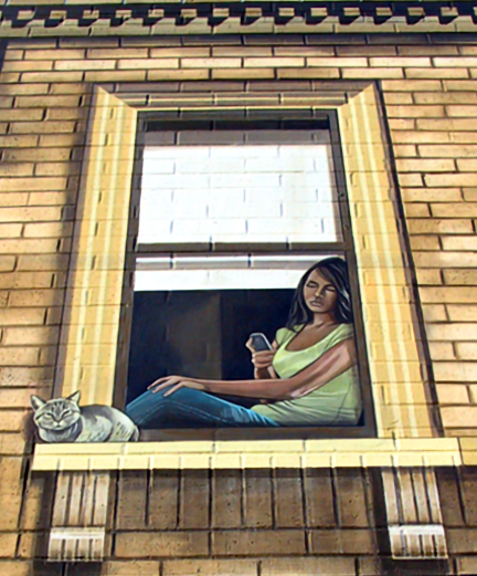
Over time, several viewers commented on how the image of the |
text
 |
||
|
The final two windows on building-6 were completed. |
text
 |
||
|
Detail of a |
text
 |
||
|
|
text
 |
||
|
The cat and the canary represented me. I was the cat, the canary my next commission. The cat could care less about what was happening below, his only focus was his next meal. It described my motivation to paint to perfection. That's what I was thinking when painting this mural. |
text
 |
||
|
|
text
 |
||
|
|
text
 |
||
|
|
text
 |
||
|
|
text
 |
||
|
|
text
 |
||
|
Detail of finished awning. |
text
 |
||
|
Sidewalk view of building-6. Notice that, even up-close, you still get the illusion of the figures standing on the sidewalk. |
text
 |
||
|
|
text
 |
||
|
The top windows on building 5 were ready to be worked on. |
text
 |
||
|
|
text
 |
||
|
This was an important image to the mural -an elderly lady watering her plants. The argument made by this image would eventually contrast with another image to be painted on one of the top window of building 1. |
text
 |
||
|
|
text
 |
||
|
|
text
 |
||
|
The father and daughter image was completed by day's end, the lower part of the window would have to wait till the next day. |
text
 |
||
|
|
text
 |
||
|
The production company filming Draft Day, an American sports drama starring Keving Costner, stopped by while I was painting utop the scaffold. They were filming additional material around town for a segment to be added to the DVD of the film. They asked if they could film my while painting and I said -"Sure; go'head". I've no idea is the few seconds ended on the DVD or the cutting floor. But, it made a boring day more interesting. |
text
 |
||
|
To protect the thin layers of paint applied during the modelling of figures, a protective coating of clear varnish was immediately after an image was completed. The fact that many pedestrians showed their admiration of the painting my runner their fingers over the painted surface, made this practice a must. Several more layers of the protective varnish were applied over the entire mural. |
text
 |
||
|
Notice in this close-up detail of the photograph, how the varnish layer that was applied around the lower part of the window on the left, affected the vibrancy of the color of the wall. The varnish deepens the colors by making them appear more saturated. This was a factor considered in the planning and selection of the color palette. What's more, in addition to also increasing protection from the damaging effect of sunlight, the weather, and human touch, varnishing the entire mural provided an uniform sheen to the entire surface. |
text
 |
||
|
The barbershop sign was completed and varnished. The name is a take on Bob Dylan's iconic song, along with other snippets of the lyrics quoted throughout the mural. |
text
 |
||
|
The barber's cat was inked and readied for painting. |
text
 |
||
|
Josh stopped after school to help out. His job for the day was to block colors on donated food items. |
text
 |
||
|
The small table is full of neighborhood donations: common food products from popular brands. Colors copies with images of these products were used as reference. After mixing paints to create the palatte, base colors were blocked. Since there is no lettering, color modeling or detailing, blocking is usually a fast process that resembles applying solid colors to a drawing on a coloring book. |
text
 |
||
|
|
text
 |
||
|
The policeman's shield and shirt patch were also completed. The number on the shield is John's birthdate: November (11) seven (7). |
text
 |
||
|
Painting progress on the second window of building-5. |
text
 |
||
|
|
text
 |
||
|
|
text
 |
||
|
|
text
 |
||
|
Paint modelling the barber was next. |
text
 |
||
|
|
text
 |
||
|
The insignia on the fireman's cap was also completed. |
text
 |
||
|
|
text
 |
||
|
|
text
 |
||
|
|
text
 |
||
|
The other figures in the group had been blocked in their appropriate colors. |
text
 |
||
|
View of work progress to date. This photograph belies the fact that this was a busy location with heavy pedestrian traffic at peak hours. Everyone seem to have a comment they wanted to share. Many were surprised when I replied in their native language, which was Spanish for most part, and in their regional slang (I'm also an actor). But the interruptions got in the way of the work. So I had Ric play the public relations man -and he took it to heart! He could have run for City Council and won! And, as he was shaking hands and posing for photos, I blocked it all out with the help of ear mufflers and painted on. |
text
 |
||
|
|
text
 |
||
|
Painting detail of |
text
 |
||
|
The fedora hat of the |
text
 |
||
|
|
text
 |
||
|
|
text
 |
||
|
|
text
 |
||
|
I completed modeling the faces of the Puerto Rican veteran and the girl in pigtails. I also started modeling the shirt. |
text
 |
||
|
|
text
 |
||
|
The elderly and children seem to have a connection of love, trust, respect and admiration that is selflessly given. I wanted to show this bond in a manner that did not shied away from showing the scars of life. So I searched for a way to visualize it in a scene that spoke volumes but did not preach. This was how, while designing the mural, the idea of showing people on wheelchairs began to take shape. |
text
 |
||
|
|
text
 |
||
|
|
text
 |
||
|
The table and the detailing of the girl's legs were completed, but the domino tiles were left blank. I was not interested in focusing on a particular play, but on the game itself. There is great symbolism in the scene. You may have heard the phrase |
text
 |
||
|
Dominoes represent age, fear, misunderstandings, gambling, loss, destruction and also failures. It is life itself. You have to play the tiles as best you can. It's the hand you been given and it will take long term planning to reach your goals. But playing the game also helps develop critical thinking and improve your math skills, which, to paraphrase Galileo, it the language of the universe. But above all, the game teaches you to learn from your failures to improve the odds for success on the next turn. |
text
 |
||
|
|
text
 |
||
|
"Twilight" is that time of day between daylight and darkness. Lighting is soft, diffused, and warm; it does not produce strong shadows or harsh lighting. Under these conditions, the mural took a magical quality that made it look real. It actually made traffic slow down as drivers looked on admiringly. |
text
 |
||
|
Much later, the barber's cat was finally completed. What is he doing? Well, being the barber's cat, he is waiting for someone to open the door so he can go in. That's it. Just a common everyday occurrance. No symbolism intended, other than the fact that cats are also part of the neighborhood and people's lives. |
text
 |
||
|
|
text
 |
||
|
The large paper pattern was cut into sections, then taped in place for tracing. |
text
 |
||
|
After the sign was traced, Josh went over the chalklines with a pencil on the rough brick surface. It was a cool Tuesday, with a slight breeze and the temperature holding at 62°F (16°C). The sun managed to break through in the afternoon to provide some walmth, but the glare on the wall made it almost impossible to see the markings without the use of dark shades. |
text
 |
||
|
While Josh and Amanda traced the sign, Ric was applying concrete to the upper windows. |
text
 |
||
|
After finishing the windows on building-2, Ric moved to the windows on building 1. The images had been traced and inked on the last day of the previous season. |
text
 |
||
|
Using a mahlstick for support, I outlined the letters with green paint, and then had Josh and Amanda finished them off. As we worked, the clouds returned and the wind picked up. Being a trained sign painter, I was fast with the brush, but my fingers were soon feeling like ice. My hands and ears are very sensitive to temperature changes. I suffer from tinnitus (ringing in the ears) and the cold made the condition worse. |
text
 |
||
|
By 2:00 pm we had overcast with 78% humidity. The wind picked up to 12 mph and we were filling it. To keep warm I dressed in layers: a t-shirt and briefs followed by a set of thermal underwear and wool socks. Over these I wore sweatpants and sweatshirt, them my back brace, and finally, an extra large white lightweight cotton hoodie sweatshirt that acted as a wind breaker or a sun blocker. A wide brim army-style bush sun hat with chin straps, wraparound polarized sunglasses, inexpensive black knitted gloves, and tactical waterproof side zip boots complete my ensemble. When I got hot, all I had to do was remove one or two items of clothing. For extreme cold weather, I added a balaclava face mask and hood. |
text
 |
||
|
As soon as I finished outlining a letter, Amanda would finish it. Then Ric and Josh would push the scaffold to the next position on the wall. Just in case the weather got out of hand, we kept several hooded sweatshirts and knitted caps available to anyone in the crew. At week's end, I would take home any used items to be washed. Another thing I'm sensitive to, is unpleasant smells. |
text
 |
||
|
One layer of paint was not enough to achieve opacity, so Amanda had to apply a second coating. I was fortunate to have another pair of steady hands needed for lettering. This freed up my time to be able to concentrated primarily on modelling figures. |
text
 |
||
|
A must in any painting crew is to have sturdy trained people that work well in a group and support each other. They are your most valuable resource and they contribute greatly to your success. So you try your best make them as comfortable as possible by paying attention to their needs. It pays to do so, because when your crew is happy, so are you. |
text
 |
||
|
This is what the first layer of concrete mix looked like as it dried on the wall. Then, a second thin layer was applied to make it suitable for painting. Eventually, a political poster would be painted over the area. |
text
 |
||
|
Ric loved location work. He started as a youth supervisor but ended up a muralist. The fact that he could do one-arm pull ups from the top bar of the scaffold never failed to amuse me. It also gave second thoughts to evil doers who might have been watching. On other jobs I have an American-Serb friend named Branko as my assistant, and he absolutely terrorizes everyone. It's good policy to have someone capable watching your back when working on less than ideal places. I'm no wall flower myself, but when I'm painting, I like to feel secure. Wouldn't you? |
text
 |
||
|
The lettering on the |
text
 |
||
|
Later in the process, the sign was completed and distressed to look old. It's purpose was to identify building-2 as a former discotheque because, to show the passage of time, nothing else conjures the 70s like Disco music! This type of sign, as represented in the mural, were common commercial back-lit signs that consisted of a molded acrylic cover placed over a metal box containing florescent light tubes and an electrical ballast. My first job in Cleveland, while attending college in 1978, was working for |
text
 |
||
|
|
text
 |
||
|
|
oooo
 |
||
|
Figure contours on building-2 were traced in preparation for concrete rendering. We immediately retraced the chalk lines with a pencil before the rain washed away the chalk. |
oooo
 |
||
|
A couple of things that were added to the design that were not shown in the design rendering, were mailboxes and areas for signs and lettering in the two recessed entrances of the medical offices. So I began the day by marking these areas in chalk and adding them to Ric's concrete rendering list. |
oooo
 |
||
|
This area in the first recessed entrance was going to be Dr. Blank's business hours. To eliminate signage that would clash with the mural, I decided to incorporate them into the mural itself. This solution proved to be inspired since it added more reality to the illusion. |
2222
 |
||
|
After completing all the contour tracings, Ric began applying the concrete on the wall, beginning with the storefront sections on building 1. I was hoping on a few dry periods so that Amanda could finish priming the bottom concrete renderings from the previous day. |
3333
 |
||
|
Ric managed to complete all the ground level concrete renderings on building-2. By now we had a very good idea of how to speed up the concrete rendering process and best prepare the surface for painting. |
3333
 |
||
|
The rain held and Amanda managed to prime the upper floor windows. I gambled on a little more time to do the lower section. But that's when we were hit by a downpour and this ended the day's work. It didn't let up so we got soaked while taking apart the scaffold and packing things for the day. Notice in the photograph the weeds growing between the building and the side walk. We still had to complete pulling them out and applying a sealer to the remaining sections. |
4444
 |
||
|
The rain is one of those things you don't fight. In some jobs, you can place a tarpaulin (tarp, hootch) over the work area to continue painting. But on others such as this one, water poured down the wall straight from the top so a tarp would have been useless. If it's early in the day you wait a for a while to see if conditions change. But in a place like Cleveland, located next to one of the Great Lakes -Lake Erie, which makes the weather so unpredictable (and weather-casters so off the mark), you are better off calling it a day and moving on to your rain-day plan, such as doing cartoons at the shop or getting badly needed rest. |
5555
 |
||
|
|
6666
 |
||
|
The sign on side wall of the recessed entrance to Dr. Blank's office received several coatings of primer and paint. This helped seal and smooth the area for fine lettering. We concentrated on this particular area since it provided some cover from the rain and the wind. Around 3:00 pm the weather changed from light rain to overcast and it held. This allow Ric enough time to complete concrete rendering on the remaining display windows on building 1. |
7777
 |
||
|
The sign patterns (one for the graphic, and two for different size letters) were then traced and penciled in. This sign would list Dr. Blank's actual business hours. Once again, Amanda took care of this part of the job. She really had a gift for this kind of detailed, repetitious, and "boring" work. |
8888
 |
||
|
While Amanda worked on the sign, I worked on the opposite wall drawing mailboxes. During all this time, patients were going in and out of Dr. Blank's office but it was a manageable situation. |
99999
 |
||
|
Once the sign tracing was completed, I mixed fluid black paint and started showing Amanda how to paint the letters. Lettering is a skill that takes a lot of practice. The size of the brush and the pressure applied while painting determines the thickness of a stroke. You need a sure, steady hand. At first Amanda was apprehensive since her first attempts proved that it was not as easy as it looked. But after more practice and the reassurance that I could always fix anything by blocking with white paint, she slowly labored on. |
00000
 |
||
|
By early afternoon, |
text
 |
||
|
The |
kkk
 |
||
|
The following day, |
www
 |
||
|
In spite of the cold weather, on |
eee
 |
||
|
As long as it did not rain, the structure provided a level of comfort and protection from the wind. Inside, a heatlamp was turned on and off to keep our hands warm. One of the platforms served as our working table. Inside the box we stored snacks, additional clothing, and my ever-present coffee thermos. |
rrr
 |
||
|
The side facing the wall was opened so we could paint. The wall temperature was above 50°F (10°C) so we were good to go. While I worked on the figures, Amanda blocked colors on the poster. We were very grateful for Dr. Blanks "tea runs" when, almost daily, he would present us with cups of warm herbal tea. I'm not a tea drinker, but in those cold moments, we gratefully welcomed the brew with open arms. |
ttt
 |
||
|
The day temperatures did not rise above 50, but around noon the sun broke through for a while and warmed us up. |
yyy
 |
||
|
The figures in |
uuu
 |
||
|
Close-up detail of the hoodie and jacket. Several characters in the mural are looking directly at the viewer. The over-the-shoulder look make this one more poignant. The painting as shown in this photograph is still a work in progress. I would not complete this scene until the end of the project. |
uuu
 |
||
|
Painting progression of building-1, as of |
iii
 |
||
|
The following day |
ooo
 |
||
|
|
sss
 |
||
|
This will be the third copy of the political poster. But there are subtle changes from the first two. Take notice of the politician's face and notice his sideburn. Then look at his jacket's lapel and his tie. Same as the discotheque sign, it's a poster from the 70's, hence the then fashionable "boot sideburn" and the wide lapel and tie. So what's the statement being made? It's basically this: nothing really changes. The promises of today were the same one's promised fifty years ago. |
aaa
 |
||
|
This day we concentrated on outlining and filling in with solid color the ground level images on building 2, including those in the second recessed entrance. |
dddt
 |
||
|
This is |
ffff
 |
||
|
|
gggg
 |
||
|
We also did sign transfers on the doors. The doors on both recessed entrances were flush (smooth) steel commercial doors. These doors are sold with a coating of gray primer so that the buyer paints them in the desired color. However, hardly no one does this last step. And so, they rust earlier than they should, usually from the bottom. These doors met with the fate. So we scrubbed them, sanded off the rust, cleaned them again and primed them twice. Then we painted them to look like... you'll see. |
jjjj
 |
||
|
Amanda worked on the graffiti and the other signs. She is wearing boots, two sweatpants, an inner sweatshirt and an outer hoodie. Her music earphones almost covered by the knitted hat. She was sitting on another indispensable tool of the trade: a collapsible/folding plastic stool. |
kkk
 |
||
|
A small plastic portable folding table proved ideal for a work table. Because of strong winds, our paint mixes and supplies were always kept inside a box, and cleaning water in small blue plastic pails. The water bottle and coffee thermos were always close by. |
llll
 |
||
|
When blocking with solid color, our rule was to paint over the dark painted outlines. I liked to do the inking myself because it provided me the opportunity to make adjustment to the drawing. For painting straight lines, I used a mahl stick as a straight edge. The ends of the stick (I had built several in various lengths) have small rising blocks at each end. So when I placed the stick over the uneven brick surface, it always remained off the surface but firmly placed. Then I ran my brush along the edge to produce perfectly straight lines. My favorite brush for outlining was the artist's Filbert head white bristle brush. |
;;;;
 |
||
|
|
thhhh
 |
||
|
The bricks on the recessed wall with the mailboxes was completed. They will be distressed another day. The mail boxes were also inked. From here, we assembled the base section of scaffolding and I began blocking colors on the second level windows of building 1. |
txxxxt
 |
||
|
View of work progression on buildings 1 and 2 as of Saturday, October 26, 2013. |
tcccc
 |
||
|
|
tvvv
 |
||
|
When we mixed a particular color, we tended to apply it in any other area where the same mix was repeated, as in the flag portion of the political posters. |
bbb
 |
||
|
The same red mix used on the poster flags, was used on the advertisement on this door. So Amanda moved from the poster to the door. Notice how I have also marked with the same red the area on the "sale" sign. This will be her next move. |
mmm
 |
||
|
I continued painting the second level windows on building 1. There was damage to the lower part of windows 3 and 4 when rain washed down soft primer (barely dry but not fully cured) a few weeks earlier. So I worked a fix before continuing work on the windows. |
nnn
 |
||
|
After repainting the damaged areas, I continued modelling paint on windows 3 and 4. |
kkt
 |
||
|
|
qqqq
 |
||
|
The window with |
wwwwww
 |
||
|
A working stiff is a person who has an ordinary job that is not well-paid. He probably works two jobs. When he comes home he is too tired to deal with family drama. Life is hard and there seems to be no light at the end of the tunnel. So he medicates with cheap beer and flips channels. Tomorrow, more of the same. The beer label reads "juice", a slang for alcohol. The shade of his window is skewed, representing a distorted view of life, colored by circumstances, and a lack of harmony at home. His house plants (a representation of the home) are not watered, and his children are neglected as he tries to stay afloat of his daily grind. |
wwwwww
 |
||
|
|
eeeeee
 |
||
|
|
rrrrrr
 |
||
|
|
ttttt
 |
||
|
The second level of building-1 was completed. Together these windows tell a powerful story that many passerby can relate to. It is a story repeated in many homes. |
yyyyy
 |
||
|
Lighting details such as lamps and hints of hightlighs were added to the storefront's dark interior. |
text
 |
||
|
Painting hints of lights and shapes in a dark background provide visual stimuli to the brain. And the brain, wanting to make sense of it all, takes into account other visual surroundings, ties it all together, and then creates the illusion of something in peoples mind. In this case, those hightlights became the interior of a storefront. |
text
 |
||
|
By the end of the day, temperatures had risen to the low 60s and the sun made an appearance. |
text
 |
||
|
Rain days followed, but Rick and I were back on |
text
 |
||
|
Ric is a morning person; I'm not. His great sense of humor and optimism has cheered me out greatly during some trying days on the job. I have always surrounded myself with talented and dedicated people who amuse me and make me laugh. This makes the work environment seem less like work and more like hanging out with your friends. |
text
 |
||
|
The |
text
 |
||
|
We also blocked the side walls. When completed, this would be the panel with the list of credits for the project. I was told that the city would place a plaque with the credits, but I didn't trust them to do so. When I say |
text
 |
||
|
I love painting plywood. I placed a piece of real plywood next to me, and then I copy it on the wall. Every sheet of plywood is an original abstract piece in its own right. No two of them are alike. |
text
 |
||
|
Ric continued blocking colors, while I worked the plywood texture. |
text
 |
||
|
The 1970's |
text
 |
||
|
The second |
text
 |
||
|
Painting plywood over the display windows on building-2 was the one change I made in the mural design. Instead of windows with broken glass, plywood seem upon reflection the natural thing to do. There were many storefronts covered with plywood in poor Cleveland neighborhoods. This was a sign of the times. As neighborhoods revitalized, plywood went away. |
text
 |
||
|
The days were getting shorter. By 5:00 pm we had to call it a day. |
text
 |
||
|
Cold weather causes muscles to lose heat and contract, creating tightness throughout the body. This results in more damage to muscle tissue that can be felt as increased soreness. After a day in the cold, we barely had the strength -or the will, to take apart the metal scaffold. So we moved around and warmed up for a while before attempting the task. I even cracked a finger once. On rare occasions, a volunteer would come by to help. |
text
 |
||
|
One of the many lovely close-up views of the Cleveland skyline seen from the balcony of my apartment building in Lakewood's Gold Coast. That night, more than ever, I wish I had my life back, so I could just sit back, relax, and recover. This was a major reason to finish the mural as soon as possible. |
text
 |
||
|
|
text
 |
||
|
Children had a prominent role in the mural's design. They have no voice or say in everything that rules their lives until adulthood. Their welfare, their growth and safety is dependant on adult caretakers. But when the institution at top breaks down, children become victims of the fallout. The scars this creates last a lifetime -and are passed along to the generation that follows. |
text
 |
||
|
This title of the iconic |
text
 |
||
|
This sign is ironic because it states that a business is open when we can clearly see is out of business and boarded up. This can be interpreted in many ways depending on your perspective of things. It could be the mentality of certain segments of society where optimism is blind to pragmatism, or the vicious cycle of a fickle economy, or the visual manifestion of the pulse of a community. |
text
 |
||
|
The awning on building-1 was completed. The address on the awning was the actual street address: 2512 Clark Avenue. |
text
 |
||
|
|
text
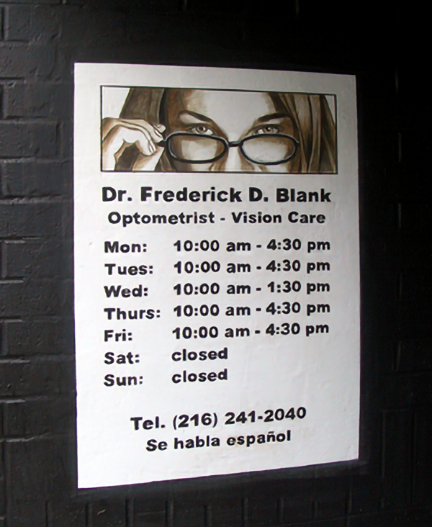 |
||
|
|
text
 |
||
|
For the past few days we had repainted the building-1 storefront's architectural framework. Sealer had been applied to the crevice between the sidewalk and the wall thus completing that part of the job. |
text
 |
||
|
I like to see murals at night with only the ambient light of street lights and moonlight. Having a balance color palette make the illusion more believable. |
text
 |
||
|
|
text
 |
||
|
This sign made a statement. Inside the Ohio map read: |
text
 |
||
|
Below the door's handle bar I lettered Dr. Blank's name and medical specialty. For good measure I added the eye exam graphic. These are the details that add interest to any subject. Even when short of time, I never neglect adding them. |
text
 |
||
|
I greatly enjoyed painting the mailboxes. I would have loved to do them in oils and have the time to do them right. But for a quick job, I think they turned out great. The recessed mailboxes look metallic, old and worn -and better looking in person than in this bad photo! |
text
 |
||
|
|
text
 |
||
|
This was the first of the large paper layouts produced to trace the large scale elements for Building 2 and 3. Once the cartoon was positioned and secured, Ric and Amanda worked fast to complete the tracing. Because, just like clockwork, the wind would pick up to a gust and tear the paper to shreads. This never failed to happen, either on this job or any other job I have done. |
text
 |
||
|
In spite of the cold, Amanda was always in good spirits. She loved working atop the scaffold. |
text
 |
||
|
While Ric and Amanda worked on the tracing, I worked below on the recessed area. One good thing about working in there was that I got some protection from the wind. |
text
 |
||
|
The door was blocked and a set of mailboxes drawn and inked on the side wall. Like the door on building-1, this was a flush metal door rusting at the bottom. The rust was sanded away and then the door was cleaned and primed. This it was painted to resemble an old wooden door with a glass window with blinds. In between the blinds and the glass was an American flag. Like everything in the mural, it was there to make a statement. |
text
 |
||
|
After the tracing was done, the cartoon was discarded into a trash bin. The chalk tracing was then inked with fluid paint. The finished drawing was that of a hand reaching for the moon. The placement of the hand was carefully designed to alined with the flag painted on the door. |
text
 |
||
|
|
text
 |
||
|
The signs on building two were aged, and a second coating of white was applied on the faux graffiti. This was my signature and the day we expected to finish the mural. |
text
 |
||
|
The door with the flag was also distressed to make it look old. But because of the cold, I abandoned painting a more detail version of the flag and kept it simple. I this point, I could barely hold the brush. |
text
 |
||
|
In June of 2018, during a restoration of the mural, I had the chance to have the flag painted as I originally envisioned it. The washed colors and tears on the fabric represented the "fading American dream". |
text
 |
||
|
|
text
 |
||
|
We noticed a yellowish stain running down between two windows. This was caused by water seeping through the other side of the wall. The top portion on the other side of that wall was the roof's parapet, which was an extension of the wall at the edge of the roof. So when water accumulated between the roof and the parapet, it came through on the other side -the mural wall. So we informed the building's owner that the parapet needed to be sealed with roofing cement to correct the problem. |
text
 |
||
|
I continued modeling the figures on the second level windows of building-2. This scene represented the stresses of life that deeply affects the home. The number one issue revealed by my research and an informal community survey, was economic pressure. Unemployment, under-employment, working minimum-wage jobs that offered no future, and the anguish of trying to make ends meet, were the factors usually stated for family conflicts. |
text
 |
||
|
Sadly the victims of conflicts in the home are children. The emotions conveyed by this simple scene are sensations everyone can understand. |
text
 |
||
|
The finished |
text
 |
||
|
|
text
 |
||
|
In this reverse image of the above photo, the writing in white becomes clear. It reads: |
text
 |
||
|
The door was completed and a protective clear plastic shield was installed next to the handle. The brick side walls were also distressed. |
text
 |
||
|
Detailing of the wall's corners was completed and the second set of mailboxes completed. |
text
 |
||
|
The second set of mailboxes were just like the first set but in a different color. I enjoyed painting them as much as the first set. |
text
 |
||
|
|
text
 |
||
|
My brother Ricky also volunteered his time. This was not his first time lending a hand, but it was the first time he sported his knitted had in such a ridiculous fashion! He has always had an odd sense of humor. |
text
 |
||
|
The cartoon of the child's face and the arms raising the beam had been drawn on a series of contiguous sections. Each section had been rolled up after masking tape had been applied along the edges to reinforce the paper and prevent it from tearing when hit by the wind. To hold the cartoon in place, we used segments of |
text
 |
||
|
By day's end, the last tracing of the mural had been inked with fluid paint and the letters of the title had also been blocked. At this point, the completion of the project was in sight. I knew I could paint large scale objects faster than it took to paint smaller detailed elements. All I needed now was dry weather and temperatures in the 40s. |
text
 |
||
|
|
text
 |
||
|
|
text
 |
||
|
|
text
 |
||
|
|
text
 |
||
|
That day, I could only work for a few hours because the skies turned black and it rained for days. |
text
 |
||
|
|
text
 |
||
|
|
text
 |
||
|
I like touches of humor on most of my works. So I added 'free donuts' to the sign announcing the community meeting, when it occurred to me that the best attended meetings I've been to, were those where donuts were served. The 'sale' sign is significant. What's for sale? Every group has an agenda not always in the best interest of the community, or there is always someone representing someone with an agenda. Truth, integrity, honesty -these are some of the things that sometimes are invariably bargained to the highest bidder or given away for the wrong reasons. |
text
 |
||
|
|
text
 |
||
|
Notice the T-shirt with the image of revolutionary "Che" Guevara. This is one of the most iconic images in the world. It has become a symbol of dissent for the underdog, of civil disobedience, political awareness, or brutal dictatorships. When using people as representation of ideals or stereotypes, I cast the faces with the care one gives to actors in a play. Wardrobe is also important. The intention is that the viewer recognizes or identifies with a character at a glance. |
text
 |
||
|
|
text
 |
||
|
|
text
 |
||
|
|
text
 |
||
|
|
text
 |
||
|
At some point, my legs were becoming as famous as the mural. I actually got eight marriage proposals from passing motorists, seven women... and one guy. Climbing up and down scaffolds helps you stay in shape. But I developed my shapely legs from years on the fencing strip. My wife finds them irresistible! |
text
 |
||
|
My ear mufflers and I had become inseparable as the street noise was almost unbearable (I also had small earplugs under the hat). Because of the glare, most of the time I was painting blind. I couldn't see what I'm doing. This meant that I had to go across the street every time I needed to check things out. Hidden underneath my extra-large sun-blocking pullover was a tight back brace so I could stand for extended hours on the same spot. |
text
 |
||
|
We spent two years of torture by noise pollution. Within a mile radius there is a conglomeration of every kind of urban noise maker around, and most within the same block we were on. Here's the round up: constant traffic on Clark Avenue and the corner of West 25th street (our exact location), a bus stop on the same block and dozens of buses per day passing by (and blocking traffic), aggressive drivers constantly honking, all sorts of delivery trucks to supply the chains of stores on Clark Avenue, near misses on a daily basis as people try to squeeze from a two lane into a single lane, or make a 90° sharp turn from West 25th unto Clark Avenue (narrowly missing our scaffold on the side walk), police sirens (the Cleveland Police Second District is within the geographical radius), emergency vehicle sirens every hour on the hour (Metro Hospital is down the street on West 25th street), fire engines (the station is just passed the hospital), an ungodly number of people with loud speakers blasting noise during peak hours, and of course, a major sidewalk and utility lines renovation project on the same street (jackhammers and generators). Add the occasional oddball screaming at some other being on the receiving end of a cell phone, and you have the complete picture of my hell. |
text
 |
||
|
In addition to the constant noise, we had to deal with the heat radiating from the brick wall and the concrete sidewalk, and sun glare. For most of the day, the sun came at us at a sharp angle since the wall was positioned east to west. This accentuated every brick line and every bump on the wall making it very difficult to appreciate the painting head on. I always wore dark polarized sunglasses since my optic nerve is very sensitive to light ( |
text
 |
||
|
|
text
 |
||
|
The public finally got to see the title. By the comments we received, I felt gratified that people got it! Many confessed to being moved by the message. For me, this is how I judge myself as an artist. It means I was able to use the right imagery to successfully communicate with my audience. But what does it mean? Written on the beam in letters is the phrase: |
text
 |
||
|
For the next couple of days, I continued by painting the hands on the beam and other details on buildings 3 and 4. The beam represented a structural element that primarily resists loads applied to it. It may bend under the pressure, but it holds; its strong fibers gives it inner strength. It takes a community to raise it, and ultimately, to build a strong structure. The monumental scale of the imagery paralleled the importance of this fact. The passing bicyclist in this photograph provide a good comparison for determining its dimension. |
text
 |
||
|
|
text
 |
||
|
Taken as a whole, the arms raising the beam -a not uncommon image in popular culture (have you not heard about "raising the barn"), can also be viewed as racial diversity in a fellowship of people working together to "raise a community". In doing so they have truly become "the people". The beam that was only dead weight, has become alive; it's sprouting new leaves. This is a sign of growth and rebirth. The beam, the life burdens we all carry, became lighter by the inclusion of all. But the decision to join in has to be made as an individual. "It's up to us -the people" to make it work by taking action in the selfless act of cooperation and sacrifice. |
text
 |
||
|
As soon as the section was completed, we applied a coating of protective finish. Being so close to completion, I didn't want to take any chances of it being damaged by passing hands. |
text
 |
||
|
After the arms and beam were completed, I moved to the child's shirt, which overlapped the arms on the left. |
text
 |
||
|
|
text
 |
||
|
|
text
 |
||
|
For the remainder of the day, I continued working on the panels. |
text
 |
||
|
|
text
 |
||
|
The day had been overcast so the sun did not bake the wall. This was ideal for blending tones on the child's face and uniform as the paint took longer to dry. Another advantage of a cloud covering is that the harsh sunlight is diffused so you can appreciate the painting. Seen under this filtered light, the illusion looks real. These are also ideal conditions to photograph outdoor murals. |
text
 |
||
|
|
text
 |
||
|
|
text
 |
||
|
I decided to make the deterioration of building-2 more dramatic. The paint chipping away represented the breakdown of the family (the narrative seen in the two upper level windows) and the scars needed to be prominent. Paint is peeling off the brick wall and the concrete window frame. The brick and concrete were left raw and exposed, the wounds were still fresh. |
text
 |
||
|
|
text
 |
||
|
|
text
 |
||
|
The couple on the window were completed, and then I began applying color glazes to the child's face. |
text
 |
||
|
|
text
 |
||
|
Later at home, I would upload the photos to my computer and look at the work progress to-date. It was only there and then, after I had time to unwind, that I could somewhat appreciate the totality of the work. On site, I could only see a piece of wall. But I didn't dwelt too much on the images. Or else, I would begin to focus on all the things I could improve, but had no time to do since I needed to move on to my next paying job. |
text
 |
||
|
|
text
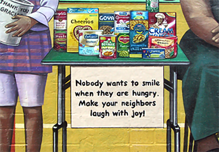 |
||
|
The reason I had waited to the end to write the inscription on the food drive sign, was that I couldn't think what to say. But that day, as I leaned back and emptied another water bottle, it came to me. |
text
 |
||
|
I finally got back to one of the most iconic images in the mural: |
text
 |
||
|
I wanted her to have the strong features of a Native American girl I once knew, those of a survivor. This face showed beauty, inner strength and the courage you must have to run away from a home with a history of abuse. The black eye represented suffering, cruelty and the violence of her mistreatment. If you were to study her face a second longer, you would also feel her mistrust of others. In 2012, a month into the painting, someone singled out this image in the mural's design (and also that of the homeless man), but the furor was centered on the runaway teenager. I refused to make any changes and the argument got very heated. |
text
 |
||
|
|
text
 |
||
|
I took this photograph the moment I finished my last brushstroke. The minute I saw the image through the camera's viewfinder, I knew this was one of my best pieces in a decade. It was a powerful visual of social commentary that did so without uttering a scream or trying to shock people. It was its casual commonality that made it so striking, and so ironic when you consider the other elements surrounding the subject. This was something I wanted to bring to the spotlight by providing the reflection in the mirror of the hidden soul. Because, even though many women and children do not show visible signs of physical abuse, they carry deep scars inside. |
text
 |
||
|
On the side wall of the second recessed entrance, I painted a panel where I could write the credits for the mural. I have been promised a plaque with the credits at the end of the job. But bureaucrats had lost all credibility with me. So I followed my instincts and forged ahead. (photo credit: Israel Perez) |
text
 |
||
|
I dedicated the mural to |
text
 |
||
|
|
text
 |
||
|
Late in the afternoon, I began finishing the last two figures in the mural. I got a little bit of shade from that sun at that late hour which made things cool enough to be able to blend colors. The following day I completed them. |
text
 |
||
|
|
text
 |
||
|
I began asking questions and talking to dealers and addicts. Being an artist opens all kinds of doors at every level of society because everyone loves art. People talk to me since they notice my interest is sincere. They are not used to that. They soon realize that I'm not judging them; I'm seeking understanding. And their raw answers put a human face to facts I knew as statistics. The too-common story is that many young people from disadvantaged homes and communities end up having problems with the law for a myriad of reasons. The end result is that they end up with criminal records no sooner they become legal adults. Once this happens, in our current system, you are marked for life. Finding a job and getting ahead becomes an uphill battle when you have a record. In the meantime, they have to survive and eventually support a family. But the only choice available to many is to do those things that got them in trouble in the first place. This becomes a vicious cycle that gets passed on to the next generation and the next. |
text
 |
||
|
The other thing to notice is that the addict is a woman. You can not see her face and the shape of her upper body is disguised by her clothing. But she has wide hips and the longer abdomen of the female body. That's how you can tell. I represented the addict as a woman because addiction, considered to be primarily a male problem, is also a women's issue with a different set of challenges. |
text
 |
||
|
At the end of it all, the main question remains: Why did I include the drug deal as an important and prominent scene in the mural? The answer is simple: because both the dealer and the addict are members of the community. Everyone knows a relative, a friend, a neighbor that is either connected or affected by this complex disease and its causes. They are human beings trying to make the best of their situation, with the same dreams and aspirations as everyone else. They are also characters in the narrative. Without their inclusion, the story would be incomplete. So instead of averting our attention from the issue (or simply skirting around it), I placed it right front and center where it can no longer be ignored. |
text
 |
||
|
|
text
 |
||
|
On October 2, 2014, I was awarded a |
text
 |
||
|
|
text
 |
||
|
|
 |