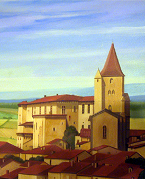
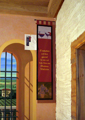
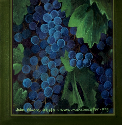
Wine Room Murals quand le vin est trés bien au Château Wolstein" -John Rivera-Resto |
 |
|
Wine Room Murals quand le vin est trés bien au Château Wolstein" -John Rivera-Resto |
|
|
 |
November 2004 was a very bad month for me. I was in a serious automobile accident that left a daily legacy of chronic pain. I spent a couple of months recovering from the ordeal and my life since has never been the same. Following a self-prescribed regiment of exercise and lifestyle changes have healed me to the extent by which I can live a normal life. But my life was never normal and a great deal of my lifestyle depended on being in excellent physical shape.
Now I suffer from a smashed lumbar disc in my spine and a damaged cartilage on the right knee. Running up and down scaffoldings or relishing the fencing strip is painful to contemplate though I still continue to improve and stubbornly resist giving in to pain. At the time of the accident I issued a statement to the fact that I was very much alive, and not killed as many believed. Another prominent Puerto Rican Cleveland artist musician (and a friend of mine) had died in similar circumstances and there had been some confusion. This was the second time in my life when condolences over my sudden death had been issued. Well, I'm happy to report that I'm still here.

|
The upside of a slow recovery: spending time with my 4-year old grandson, Sandro (Samuel Andrés). |
Most of 2005 was a battle to improve and adjust to my injuries. I went through periods of anger and depression. My concentration was shot -though I still managed to function and take on jobs which I could perform on my computer (see works for 2005 and 2006). However, it was painful and uncomfortable to be seated even for a short time or to lay down for a good night's rest. Eventually the sharp needle-like stabs of pain subsided and mobility returned, though for a while I walked with the assistance of a cane (and still do on bad days). I stayed away from painting -an easy choice (I do hate painting but need the money), and concentrated on something I greatly enjoy: doing research and teaching. So in the spring of 2005 I taught a series of lectures in two area colleges on art appreciation, history and philosophy, and a visual history of mural painting around the world.
My lectures were quite a hit with students. I always teach from the devil's point of view, asking the hard questions and biting away at prevalent artistic dogmas. And, I like to put on a good show! I do believe (and students do confirm) that most of the material I talked about was new to them and that kept things interesting. Having great visuals is instrumental in achieving this goal. So each lecture was supplemented by a PowerPoint presentation with dozens of pictures from my extensive library of images and newly designed diagrams to simplify and clarify understanding. Many people are not aware that my background before painting was in theatre -writing, directing, acting and production. So to add more colour I indulge the class with my skills in storytelling, using a variety of accents to tell anecdotes, and with irreverent humour peppered them with adventures and misadventures from my travels.

|
It's showtime! -Who said teaching has to be boring? |
I would do anything that made the material come alive! Even some of my introductions had sound and music to complement the imagery and move along the narrative and the anecdotes. I mean, how can you really understand any artist and all those things that bring insights and meaning to their work, without digging into their intimate lives and all the juicy gossip surrounding them? But above all, I carefully designed my lectures in a presentation style that was simple, intelligent, and in common sense language that even my grandmother could understand without even speaking the same language. Imagery can do that. This is why it took me an average of 20 hours to prepare for a one-hour lecture for a total of 30 lectures divided into two main subjects.
The student's response was immediate and enthusiastic. After the second lecture, my originally planned class of fifteen students was transfered to the college's auditorium to accommodate an excess attendance sometimes numbering one hundred. It seemed that people where cutting other classes to enjoy my presentations and many were bringing friends that where not enrolled in classes at all. My courses were part of an 'over 50' program aimed at personal enrichment and not for credit. They were there because they wanted to learn about a topic that interested them. This resulted in tough and clever audience and a wonderful experience for me.
Among my students were housewives and retirees, government employees, a couple of architects, two published authors, a judge, several doctors, law enforcement officers, educators, artists, gallery owners, and many other representatives of the business and professional fields. I particularly enjoyed the standing ovations at the end of the lectures. Now that's theatre! The only negative thing about teaching is that is doesn't pay. I was not part of the regular staff and, much as I tried, I haven't been able to secure full-time employment as a college instructor in any area college. I do have all the qualifications (and more than some), but a lot of it has to do with the bad market in the Cleveland area though I believe a greater part has to do with the way academia works.
|
My first trip to Florence in 1999. Teaching should never be boring; it must engage and captivate the senses. So if you want to teach about, lets say, a particular country, first you study anything and everything available to you in books and other media including films. And I mean everything -the history, culture, economy, politics, prominent figures, the geography, social issues, the language, it's people, religion, education, its mores, its laws, and so on. Then you travel to that place and test, revise, discard or reafirm every you though you knew. This is why traveling is so important to complete your education. Nothing makes teaching more personal and interesting than speaking from experience. For a teacher this practical and first hand knowledge is priceless. It also provides you with a file of anecdotes that will make your lessons come alive. So one should have a goal list of places that capture your interest, plan trips -even if all you can afford are short visits of a fews days, and go. |
I mean, if an instructor was needed to teach a class about "John Rivera-Resto" they would rather hire "Jane Chang Duo" from Timbuktu instead of me. Here's something to think about. Imagine having Simon Cowell (from American Idol) doing a show where instead of singers it would be painters the ones having to audition. Can you begin to imagine how much fun this would be? It would revolutionise art in this country, especially the way it is taught. Do you have any idea how many people "believe" they can paint? Oddly enough you find them teaching in our fine schools. In my experience, great painting instructors are rare.
If you were to visit art classes in any college near you, chances are you will find two types of instructors: the teacher who knows the craft but can't communicate the knowledge to others -even if you follow them around with a spotlight, and the one that is book-smart, has all the diplomas and talks the talk, but has no experience surviving a day in the real world if they had to make a living from producing art. They remind me one of my old professors at Cooper School of Art in Cleveland who made the class draw "headaches" (for the entire week!), then crumple all the week's paper output into balls, throw them into the centre of the classroom thus creating a huge pile, and finally had the students lay down on the floor and "swim" into it -to get the aesthetic essence!
|
||
|
And as always, please feel free to write me with your comments and questions. I am still your humble servant. My e-mail address is in the 'contact' page. Cheers everyone! -John Rivera-Resto, March 2008. |
This idiotic episode burned in my heart the resolve to never waste an opportunity to expose all the rubbish created by modernist theories of art that have wasted the time, the illusions and the money of so many promising students. I fervently believe that the public has enough taste and brains to know what they like and dislike about art -if academia would only listen. As an instructor I like to reassure the public that if something looks like crap, it is crap. This was at the heart of my lectures.
But much as I enjoy the teaching and the camaraderie of the students, I could not live on peanuts (Lord knows I've tried!). And so, in spite of my new "groupies" persistent calls to return to the teaching stage, I opted not to teach for the time being and began working on some personal and more lucrative projects. I continued this trend until one sunny autumn day when I sat down to check my e-mail. And here is where this story begins.
But first, a disclosure. In order to be able to bring transparency on how things happen in career, I have to let you into my own private world and guide you along for an exclusive over-the-shoulder view. I will provide you with a background of my daily life and the things I have to do to make a living as an artist. However, I will not specify names, addresses and certain details that may infringe the privacy of others. As a matter of fact, I do get certain projects because of my known capacity to keep and guard secrets. When I do mention names it is because these individuals are already on the public eye or they have no objection to being mentioned in my anecdotes. I reserve judgement. Now to our story.
On the twenty-third of October 2006 I received an e-mail inquiry about a potential project -a mural. Since my accident I had not done any significant painting, that is, any large-scale work. I had been approached to do murals in the city of Dubai, United Arab Emirates, and the lure of travel to exotic places was an intoxicating scent. But the negotiating process was slow and this new prospect very much in the future. So for the present, while busy with work, I was bored. The new "contactee" was a designer from a Cleveland-based Interior design firm. They had a large contract and needed someone to paint a mural on a wine tasting room. It so happened that she did a web search and my site came up. And, surprise, I was only 15 minutes away. So I replied and made an appointment to visit their shop located at the heart of downtown Cleveland.

|
||
|
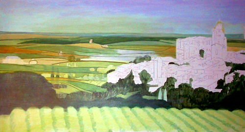
Adobe Photoshop conceptual design for wine room main mural. Since this job depended on client approval, I did a digital painting of the design showing all the details of the composition. Before Photoshop, I would have done a small rendering in tempera. |
Before I continue I should mention that I don't particularly enjoy working for a "middleman". I have past experiences where I felt the client was not well served by this arrangement. While it is great for an artist to have a source of ready work without having to deal directly with "the customer," I deliver vastly superior work when I have access to the client. It's a personal thing. In getting to know the person directly I absorb a better understanding of that person's essence which can then be infused into the art. This is what makes each work unique, a one of a kind creation and not just a generic and meaningless decoration that can be applied to anyone. This is what distances true artists from mere painters -as you will see.
In spite of my reservations I met with the interior designer and the owner of the firm to present my portfolio and discuss the project (I was not the only artist being considered for the job). While most people who hire my services approach me because they know my work, this was not the case. In fact, I was coming from the cold and had to prove myself, just like any other artist. In such occasions I tell people to look at my website because this is my portfolio. Everything about me is there to see and read about. For this occasion I brought along a copy of my portfolio on CD to leave behind (this was 2006, a few years before flash drives or Dropbox).

|
Conceptual design for wine cellar hallway. This design is based on real data. This is the way wine barrels are stored in many Old World wine cellars. |
After the usual formalities we discussed the business at hand. Their firm was doing a major job and they wanted a mural on the wall of a wine tasting room. They were very vague about the client and the location of the job. This is a protective practice by many professionals who fear that giving away too much information may in some way harm the client or take business away from them (at least this has been my experience). The negative result of this is that in being too subtle about being subtle you don't get much of anything to work with. On the other hand, if you are a painter who is simply grateful to get paid to paint a wall, no questions asked, then this is the way to go.
The lovely ladies showed me a sample image of a vineyard painting for me to get an idea of what they wanted and asked if I could do it. That was not much to go on. I felt I did not have enough information about the location of the mural in the architectural scheme -an extremely important element in mural design, so I asked for the site's blueprints. Architectural blueprints are an excellent way to get mentally situated in order to better envision a project. Considering that I grew up among family in the construction business, and being an interior designer in my own right, I have been into blueprints since I was a kid and can visualise any job in 3D.

|
Conceptual design for wine cellar hallway, perspective view. |
After going over some of the details I told them what I would do and gave them an idea of my fees, making it clear that there is no way to price a mural until the conceptual design is made. It was apparent to me that they were experienced decorators but had no previous experiences with mural artists. But they seemed very receptive to what I had to say (after all, I have done some impressive commissions). During the discussions, in addition to the wine tasting room mural, the designers pondered ideas about what to do with a hallway connecting the wine tasting room to the cold-storage wine cellar. Decorating the hallway with the covers of wine barrels was discussed; I suggested -"Why not paint them on the wall?" I was half joking, but immediately it dawned on all of us that this had possibilities.

|
Conceptual design of two large floor wine barrels on opposite wine cellar hallway wall. |
I felt it had been a good meeting as I walked (actually I hobbled with my cane) passed the next waiting artist in the lobby. Thirty minutes later I learned who the client was and the location of the job. All I needed was the name of the architectural firm from the blueprint and a phone call to a friend to get the information. Though I had never met the client in person I knew who he was. All you had to do was read the papers. He was the chief executive officer of Developers Diversified Realty Corporation (the nation's largest community shopping center developer) -Mr. Scott A. Wolstein. The Wolstein family is a prominent one known for their philanthropy and having their name grace a building or two. Now Mr. Wolstein was constructing a grand residence at his country estate on the outskirts of Cleveland. This was the site for the commission.
I have visited European palaces, mansions and grand manors in England, France, Italy and Switzerland -and a few regal estates in Latin America as well. Cleveland, like any other major American city also has its share of grand residencies and once in its history was world renown for its "millionaire's row", one of the most beautiful and affluent neighbourhoods in the entire nation. The signs of this magnificent distant époque have enriched the city with a legacy of great architecture and artistic institutions. However, all this is in the past. No one builds in that grand style today. Or so I believe, until I drove into the Wolstein estate.

|
Ravencrest, the estate's name and heraldic coat of arms in carved stone relief. |
Well, driving is not the way I would describe my first visit. It was more like gliding in mud. Weeks passed before I received another e-mail from the firm. They needed price quotes on the murals -and had decided to also include the hallway. And yet I had not told anything about the site. I replied that I needed to do a site visit, measure walls, and so on. Only then could I come up with a proper design and price quotes. Finally I was given an address and the site visit was scheduled.

|
A much improved country road in early spring. The estate is about a mile from the main road. |
The day of the visit was during the middle of winter. It had snowed heavily but then warmer temperatures moved in and the snow became dirty slush. I remember laughing myself silly at the absurdity of having washed and waxed my Villager van the day before -something I rarely do. The miles-long road into the estate was an unpaved dirt road being travelled by construction vehicles and heavy machinery. With close to a hundred workmen, visitors and support at the construction site moving to and fro, the road had turned into a mud pit. I had mud up to my van's doors! General Patton would have felt right at home guiding his Third Army armoured columns through similar roads in France during World War II.
The construction site was impressive. The manor, erected on a section of land that had been cleared from the surrounding woodland, would have been right at home in any European country estate -there were even deer prancing around! While not as large and imposing as some Gothic manors of old, the structure had all the elements of style and texture reminiscent of the period. And at 36,000 square feet, the home is the biggest in Northeast Ohio.

|
The gatehouse to the Wolstein Estate under construction. |
I love architecture and I love construction sites like a kid in a sandbox; there is so much to see and learn from. I could tell right away that the calibre of craftsmen at the site was top-notch. There was even a team of Amish! In my book, Amish craftsmen are like the bridge between builders and artists. We are very fortunate in Northern Ohio to have them and I love to see them work. I confess that the best thing about this job was witnessing the work progression for an extended period of time and making new friends among the workmen.
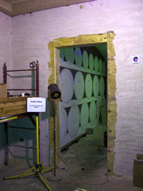
After introductions to the general contractor and one of the architects, the designer and I descended into the lower level and I was shown into the room destined to become the wine room. There was activity everywhere; everything was controlled chaos. Nothing was near finished; the only thing standing were the stud wall partitions; none of the walls had been surfaced. It was obvious that it would be months before I could even begin with the job. But at least I could take pictures of the space and note the location of the one window where natural light was coming through, and the openings into the room which offered the best points of views. This was enough to come up with a design.

|
The wine cellars under construction. The far wall where the mural was to be painted had not been surfaced with drywall at the time of my first visit. |
From working prints I was shown an elevation of the main entrance into the room. The architect had intended to reproduce the massive rustic wood beam-and-post architectural features of a medieval (Gothic) castle. The walls would be surfaced with a veneer of 'distressed' plaster with rough stones showing through. It was pretty much the method we used in the theatre when building sets. The floors finish would also be of natural stone, though I had no way of knowing what size, cut or colour -elements that might prove useful in my design.
I proceeded to inspect the hallway connecting the wine room to the wine cellar. Again, all the walls were just bare studs. The hallway was narrow. Not much viewing distance to appreciate a mural in its totality. This was going to be a close view affair with little or no use of perspective illusion. In such enclosed spaces the best thing to do is surround the viewer in the illusion by including the surrounding walls and ceiling in the effect. I brought up the idea to the designer for her consideration.
|
The design transfer to the wall is completed. Electrical power boxes are in place for the later addition of lamps. Notice the string at the wall tacked to the vanishing point in the horizon line. By dragging the string around I could accurately draw all the perspective lines. |
Normally, I would discuss this with the client and get a prompt response. The issue is settled on the spot. But with a middleman a suggestion has to go through several people before a decision is made. The middleman is naturally concerned with the bottom line and adding more work means a larger bite out of their budget. I understand this concern but I also believe that since the client is ultimately paying for the service then he or she should be the one deciding is something is worth considering. My interest is making sure the art looks fantastic at the site and thus I advice on any element that would make it so.

|
A blue-plastic dust cover. The cover hangs from a wooden bar suppoted at the ends to the ceiling with a cord. At the beginning of each painting session I simply swing it aside to expose the wall. The cover was made by joining four sections of inexpensive disposable plastic table cover with clear tape. |
I returned to the wine room for a final look when suddenly I perceived a change as everything seem to go still. I turned around and noticed two gentlemen in businessman attire doing the rounds. I forgot to bring my prescription glasses (a really, really bad habit of mine) and all I could see were blurry images. But I did not need to see clearly to understand by the deference everyone gave the gentlemen that one of them was Mr. Wolstein. He was showing the other gentleman around and describing some of the final features for the place. He courteously acknowledged the designer and the wine barrel mural was mentioned. After a beat, I took my cue.

|
These are my two lighting workhorses: Cindy and Mindy -my two spotlights on telescopic microphone stands. Paints and assorted supplies are organized in plastic containers and stacked on top of the lock box at the end of the work day. Then everything is covered with a clear plastic drop to keep away the dust. Construction workers could easily move supplies out of their way by rolling the lockbox to another location. |
I moved in and mentioned how much better the effect would be if the entire hallway was included. There were a few moments of silence in which I felt all eyes on me. Then the designer, who seemed to be looking at him, and then at me with some apprehension, broke the spell with a quick introduction, pointing out that I was the muralist. I nodded. Then the gentleman with Mr. Wolstein picked up on my idea and really did a great job of noticing and further elaborating on the obvious benefits to the space. Mr. Wolstein thought for a moment, nodded, seemed pleased to hear about it, and moved on. And that was that.
Before leaving the site, I promised the designer that I would e-mail my mural designs for consideration. I had come to recognize that simply describing what I intended to do (as I do in most of my jobs) simply would not do since they were not familiar with my work. In addition, the firm needed to show something to the client -a step I usually do without. Once the designs were made and approved I could then provide her with a price quote for the job. I left the site with the understanding that the room should be finished (or at least the mural wall) by the beginning of spring, in March or April. I thought this was doable, after all, how long does it take to install a few sheets of drywall?
Back home I made conceptual design paintings for the wine room using Adobe Photoshop. After studying my notes and reviewing the reference photos taken during the sight visit, I sat back, coffee cup in hand, and let things flow. Visually I kept going back to my own experiences in Italy and the south of France. I remembered the pleasure of enjoying a nice aperitif while sitting at a small outdoor table, feeling the warm country breeze and drinking up the scenery in the company of my lovely traveling companion, miss Nancy Lewis (see 'the Lewis Apartment Murals'). I wanted to somehow express that sentiment of being there in the mural.
|
I started the painting by applying color washes (thin paints rapidly applied) to the landscape areas inside the arches. Notice the plastic cover now swung to the right side wall. |
It is important that one understands what is at heart when creating art. This is why I like to pick the client's brain and take as much of the site as possible. One never knows what will spark that special something. I kept stirring things around. People drink wine not because they are thirsty or because they want to get drunk. People drink wine because they like to enjoy life. It's a celebration of living to be shared with family and friends in an intimate and comfortable setting, close to nature's beauty and the soil that gives it birth. This is a sentiment very close to my heart.

|
My painting setup consists of a small decorator's scaffolding, a green supply metal lockbox, and a lamps array for illumination. The lockbox is on casters for easy movement. |
In my mind I saw the wall of the wine room at the Château opened up to reveal through arched windows scenery of beautifully cultivated vineyards in a valley protected by hills and distant mountains. I felt myself walking through a wide arched opening into an outdoor patio that was enclosed by a balustrade, with steps that led to the fields below. And what better place to admire the view than sitting by the patio while enjoying a bottle of wine? That was the picture inside my head.
Now that I had a picture, I broke things into elements: vineyards, a wall with arched windows, an arched passageway, distant hills, a patio, small table and chair and a bottle of wine. Note that the art in a conception is more than just the addition of elements. The art is in the way one "combines" these elements to create a perceived illusion, not simply to incorporate the function of the wine room into the thought process, but to increase the pleasure and the sensations of the experience.
|
Dust was ever-present because the area was a very active construction zone with stone and mansory work going on. But an even greater problem was lighting glare. I needed strong lights to work but, being boxed in on both sides, I could not avoid harsh reflections on the wall. So the lamps were continually being moved around trying to find the best possible lighting position. I constructed my own "paint-can" and microphone stand spotlights when I was too poor to buy commercial ones. They have been with me for over 30 years. |
With this in mind I reached for my computer's keyboard, checked my image files for references in search of my list of elements, and then proceed to create the visual rendering in Photoshop. I painted the image to the scale of the actual wall, saved the file, and then e-mailed a copy to the designer. The toughest part of the job was done -coming up with the design; painting a mural is the easy part. The designer's response came a few days later, with the additional request to do the design for the wine cellar hallway and to include corresponding price quotes. I still did not know if we were going with the idea of doing all the walls in the hallway or just one wall so I asked for clarification. I also requested a list of the client's favourite wines thinking of ways to personalise the piece. She confirmed that we were going with the surround-wall murals in the hallway and, a few days later, sent me the list of wines I requested.
|
My lamps allow me to easily adjust illumination to my needs. At the beginning of every project I make a note of the type of lighting that the finished art will viewed. Then I change the lamps inside the fixtures to approximate that light -warm, clean, or natural (2700 to 4000K). This way I adjust paint colors accordignly. If I do not match the lighting, the colors in the finished piece will appear different. Presently, the original spotlights have been replaced by High CRI Dimmable LED PAR30 lamps, 4000K (natural light), with medium and wide lenses (35 and 60 degrees). |
The procedure for the other mural designs was the same. After drawing the wine cellar walls to scale, I proceeded to design an overlay of the mural in Photoshop. I had researched wine barrels before for several of my set designs so this feature of the mural was much easier to conceive. I did three rows of wine barrels using actual photo references from wine cellars in European châteaus, making sure to use the correct size since the wine industry has a standard for barrels. Next I placed the brands of the client's favourite wines on a row of barrels, which I felt was a nice touch.
For the opposite wall I designed two huge tavern barrels placed in their own niche, one at each side of the wine cellar door. Above these I positioned iron wall brackets (iron candle holders) based on a picture provided by the designer. There is a lot of guesswork when you create conceptual designs. When you do not have all the facts you simply fill in the holes. The purpose of a conceptual rendering is to give visual form to an idea. At this stage you can make changes and revisions until the plan is approved.
Naturally, I waited for approval before pricing the job. I can not do otherwise because of my pricing method. This is how I do it: after the designer or client sends me confirmation (we communicated through e-mail in this particular case), I then proceed to estimate the cost of equipment, travel, and supplies -this is a set cost. On out of town jobs I add the cost of travel, room and board to this figure. Next I estimate how long it would take me to do the job. I set the price of my labour based on a daily fee. So to arrive at my final estimate I multiply the number of days by my daily fee, add the cost of materials, travel and supplies, and total the numbers. The resulting figure is the cost of doing the job.
|
My painting method: the town (and all man-made objects) are drawn in detail; the surrounding landscape (organic nature) is loosely built in a fluid series of coloured layers (washes) using thin semi-opaque colours. Successive layers of opaque paint will build up detail. |
A frequently asked question is: -How do I know how long it will take to paint a mural? This is based on experience. Every artist paints at a different rate. Therefore, my rates do not necessary fit another artist. Twenty years ago it took me four times longer to do badly what now I do well in one day. I'm a fast painter, I'm very experienced, and I charge the same regardless of whose paying. Some murals are more complex than others, but since I charge by the day, it doesn't matter what the subject is.
|
The landscape was completed in a soft, blurred, and impressionistic manner. |
Sometimes I get additional benefits. Potential clients pay for my fare, time and expenses for out of town visits to a job site or to discuss a potential project. A few clients have spent hundreds of dollars in food and entertainment simply to convince me to take a job (it doesn't always work). Also, I have had clients so happy with the results of my painting that they have added bonuses upon completion. However, these kinds of benefits are the exception. In my experience, people outside the United States have been more gracious. Perhaps this is so because money, wealth and the value of art are perceived differently.

|
The French town was painted in a sharp, focussed, and exacting manner. The town was modeled after the medieval town of Lavardens, in Gascony. |
But I can say without reservation that I think the greatest benefit of being an artist is getting to know really interesting people. In essence, it is almost like becoming a trusted family friend. Clients allow me to enter their private space. For them commissioning my services is considered a mark of prestige; a qualifier of having been served by one of the top muralists in the business. I am "their artist"; there is a bond and a mutual exchange of trust -and there is great value in this.

|
Background scenery with the French town, surrounding landscape and sky completed. All the stages of the painting process can be seen in this image. The vineyard and middle ground tree line will be next. |
By now you may have realized that my conceptual designs are crucial in estimating my work schedule. Any deviation from this -such as adding, taking away or altering the drawing, will affect my timing. To make a living as a painter you need to line up work as far in advance as possible. If I get stuck on a job and take longer than anticipated, this means I may loose the next one in line. I should also make clear that at this point that a conceptual design is a simplified version of a mural, an approximation of the final piece; just the general idea. Unless one is precisely copying a picture, like for example -making a reproduction of one of Michelangelo's frescoes in the Sistine Chapel, conceptual designs are exactly that -conceptual. Generally the finished art is better than a few inches of sketch!
The cost proposal was approved and I was anxious to start the paintings (the sooner I begin the sooner I will be available to take another commission). I figured the area walls must have been surfaced by now. During the waiting period the designer had asked about the placement of electrical boxes for the lighting and I sent her a schematic. That's the advantage of working from scale drawings -you can place things with precision by simply using a ruler. I also requested a sample of the lamps before I began painting. This way you can make alterations to the composition; take into account the placement of shadows cast from these practical lightning sources, and in doing so make the painting and the fixture blend nicely into the overall design. Unfortunately, all I got to was a picture to go by (I finished the murals before the lamps were installed).
|
John necessities are kept nearby: a coffee maker, a CD player for music and audio books, a small microwave and plenty of snacks. After completing the wash stage by applying underpaint to the background landscape, I began detailing the composition in successive layers of opaque paints. |
It was already the middle of March and I was still waiting. I figured by now the room walls had to be surfaced. During another visit to the site I was disappointed to see that while the walls had been covered with sheets of plywood and drywall, they were not finished and the hallway walls were the same as I had seen them last. In a meeting with the decorator and other contractors I told them that all I needed was one finished primed wall to do the mural. As long as I had access to electricity and running water, I could begin the job. What's more, I would work at night thus avoiding getting in the way of the daytime crew. This would also allow me to work in peace without the noise of power tools going on at all times.
And so, it was then agreed to have the wall ready in a couple of weeks for me to begin painting. Finally, in April, the wall was ready for me (though the hallway walls remained unfinished). Beginning the commission later than I had anticipated meant that I had to reschedule the beginning of another job for later in the summer and begin work on other commissions while I was waiting for the Wolstein site to be ready. During this time I also did some out of state traveling to see potential clients.
|
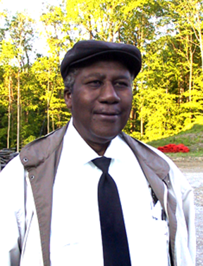
Mr. Jerry Smith -my latenight critic. Jerry also kept me updated on developments of basketball legend Lebron James' home construction site since both sites were guarded by the same company. |
My first move at the site was to make friends with the security guards. The worksite was guarded around the clock and there was only one way in and out. The first person you greeted each day was one of the guards. During all the long nights you could always take comfort that someone was nearby in case of an emergency. Pretty soon the guards were making the rounds to check out my work progress and I got to know them well. In fact, I'm still good friends with one of them: Mr. Jerry Smith, an ex-navy man and steel worker with a life as interesting as a John Le Carré novel.
With the help of my brother Ricky and his pick-up truck, I brought in my lock-box -a steel metal box on casters where I store most of my equipment, supplies, a mini-scaffolding, and my personal kit. The paints and brushes I kept in sealed plastic containers which I would stack on top of the lock box at the end of the work day. My paints are separated by hues. All the reds are stored in a container, the blues in another, and so on. I like to keep things organised and tidy at the work site.
My personal kit includes everything I need to be comfortable at a job site. A CD player for my music compilation of favourites and for listening to audio books, a coffee maker and a small microwave, a change of clothes, toiletries, a box of canned soups, snacks and fruits, and a plastic container with drinking water. I also have a miniature battery-operated TV to catch the news. Another very important item in my kit is a jumping rope, which I use to relieve stress or get rid of excess energy. Keep in mind that it is not unusual for me to work 12 or 14 hours in one spot and to be on site for weeks (though I break the time into different tasks lasting no longer than 4 hours to break the monotony).

|
Detail of wine bottle and glass in progress. Notice the completed middle-ground vineyard. |
The rest of my set-up was made up of an image projector -with its own stand, a flashlight with extra batteries, a dense-foam pad -for kneeling or sitting when painting close to floor, a lighting kit made up of a light strip and "Cindy and Mindy" -two spotlights, and my digital camera. At the end of each day's session, everything would be put away or placed on top of the mini-scaffolding and the lock box and covered with a plastic dust cover. This kept everything out of the way of the day crew and had the convenience of being on wheels just in case it needed to be moved without much effort.

|
Wine bottle, glass and plate of tapas completed. I personally asked Scott Wolstein to pick the label for the bottle. His choice: Château Lafite-Rothschild -one of the best French Burgundy wines in the world. |
Finally, to complete the set-up, I constructed a dust cover curtain for the wall using plastic 'table cloth', made by joining several length of material with clear tape, creating a pocket at one end, sliding a length of wood through the pocket, and hanging it to the ceiling using hooks and small pieces of chain. Everyday I would unhook one end of the cover with a long pole I brought in for that purpose, next I proceeded to pivot the curtain on the other end away from wall, and then I attached the loose end on another hook. After a painting session was completed I reversed the process and protect the painting with the dust-cover. It was simple, efficient, and very economical.
My daily routine varied little from job to job. It would consist in starting the coffee maker, uncovering the painting, positioning the lights, filling a 5-gallon plastic bucket with fresh water (for cleaning brushes), setting up my paints mixes for the day, starting a music CD, and then clearing my mind of all thoughts while singing along the music and sipping my first cup of coffee. Then, after reaching a proper state of relaxation, I would begin painting. Every 20 minutes or so, I reach out for a cracker, a piece of fruit, or my water bottle, and half-a-cup of coffee (just milk, not sugar) every other hour. After about a four-hour session, I usually have a cup of homemade soup (which I bring frozen in a plastic container) or, if I'm out of homemade, I'll have a canned soup (Healthy Choice® Old Fashioned Chicken Noodle is my favourite).
The first step in painting a mural is preparing the surface of the wall (or "muro" from which we get the word "mural"). "Prep work" is the most important factor in a mural's longevity. The finished mural will only be as strong as the weakest primer. Considerable time must be devoted to inspecting and preparing the wall for painting. Surface imperfections such as bumps, cracks, nicks and roughness must be corrected before a suitable primer or basecoat is applied.

|
My high density foam kneeling pad. This is a must. Period. |
The new wall for the wine room mural had been treated with two coats of commercial-grade primer (as per my request to the builders). I began by inspecting the wall for imperfections. New drywall can be very absorbent and porous necessitating several layers of primer to stabilize and seal the surface. I noticed patches of roughness and some areas of greater porosity, most likely due to uneven application or absorption of the primer. This needed to be corrected.
My ideal surface for painting must be smooth, non-porous, non absorbent, and with a certain amount of "tooth" for better pigment adhesion. I began by 'skimming' a fine coating of spackling compound to cover a few indentations and then I smoothed the entire surface with fine-grade sandpaper. Next I proceeded to 'clean the entire room' to remove surface dust. Dust is a painter's worse enemy; paint will not adhere properly to a dusty surface. After sweeping and vacuuming the area I mopped that section of the floor. Then I cleaned the mural wall with an industrial sponge (a large cleaning sponge would do to) and a solution of lukewarm water with a cap-full of dish detergent.
After the wall dried, I applied a thin coat of good quality water-base primer which I had tinted with a touch of red. I tint the primer because it is slightly less reflective than just white and because it makes it easy to notice miss-spots. I applied the primer with a large brush instead of a roller because I prefer the uneven surface-tooth left by the brush's bristtles when applying the primer in strokes going in several directions. Next I added a second layer of a thinner solution of primer and allowed at least 24 hours of drying time. During the following session I went over the entire wall with a scrub pad to smooth away any remaining imperfections and finished the prep stage by wiping the surface clean with a moist cloth. Satisfied with the final result, I was now ready to begin the layout or transfer of the design unto the wall.
There are several methods for transfering a design to a wall surface. You can draw the design by "freehand", or "trace" a projection of the design, or "square" the wall for an accurate transfer. I used all of the above. However, each one of these techniques has advantages and limitations. The trick is to know how to combine them to bring the best result.

|
Image projector with homemade lense extension. I transfered outlines of small objects to the mural with this valuable drawing aid. This was also the perfect tool for projecting and centering the inscription on the banner. |
Traditional mural painting relies on the squaring technique, especially for large scale murals. This is also known as "the grid" method. It consists in dividing the original scaled design into squares (thus creating a grid), then dividing the wall into the exact same number of squares as the design, and them proceeding to carefully reproduce the markings contained in each square in the design to its corresponding square on the wall. Eventually, square by square, the drawing is transferred with a high degree of accuracy.
For certain features in the mural, such as the outline of the French village, I used a projector. "Opaque projectors" have been produced and marketed under a variety of trade names as artists' enlargement tools to allow images to be transferred to surfaces such as prepared canvas, or for lectures and discourses. The projector -also known as an epidioscope, epidiascope or episcope is a device which displays opaque materials such as drawings, images of book pages and the like, by shining a bright lamp unto the object. A system of mirrors, prisms and/or imaging lenses is used to focus the reflected image of the material onto a viewing screen or wall.
For me the projector is mostly a time-saving device. But it also helps greatly when deciding on compositional changes. For example: by projecting an object on the wall, such as a wine bottle, one can move the object around to improve its placement on the composition before tracing the drawing. One can also reduce and enlarge the size of the projected object by simply adjusting the distance of the projector from the wall and making adjustments to the lenses. However, projection works better when the size of the projection is small because the lenses distort the projected image as it grows in size (you get a "fisheye" effect). For this reason I limited the use of the projector for the tracing of small objects, such as the Grossbeak or the lettering on the banner for which the tool is ideal.

|
"Blocking" foreground -applying opaque base colors on the foreground architecture. Background landscape is near completion. |
One word of caution about using projectors: they get really hot! Their internal cooling fan does an adequate job of keeping the heat generated by two 100-watt lamps under control. But over an extended period of use, the temperature builds up. The intense heat also affects the material being projected. Paper enlarges and contracts under the radiation and the projected rendering gets distorted. So ideally, one should use the projector for short period of time -and work fast!
After transferring the architectural elements of the design by squaring, I drew other elements by freehand, such as trees and landscapes. I used a charcoal stick instead of a lead pencil because the marking can be easily wiped clean with a dry cloth. Once the entire design was transferred unto the wall, I proceeded to "correct" all my perspective lines. No matter what transferring method you use, the perspective in each design has to conform to the way it will be viewed in the actual space. A common feature of inexperienced artists is not making perspective adjustments to their layouts after making the design transfer.

|
Foreground base colors completed. Shadows and highlights were added and the upper right corner banner was also blocked. |
For the main mural I used a "one-point perspective" where parallel lines converge to one point somewhere in the distance. This point is called the vanishing point (VP). This gives objects an impression of depth and three-dimensionality. I established the position of the horizon line by determining the most likely spot where people would first see the mural (their "eye level"). Then I tacked a string line to the VP on the horizon line and pulled out the string around the layout to make sure all my converging lines extended correctly to this common point.
The last step of the process is to "fix" or "ink" the drawing permanently to the wall by going over the outlines with a marker or fluid paint or both. However, I do not ink the drawing until I'm completely satisfied with the composition. It is easier to erase outlines done in charcoal than lines fixed with a permanent marker. I learned by experience that the only effective way to erase marker lines is to sand lightly and cover with a fresh coat or two of primer. Finally, after transferring the design to the wall, adjusting the perspective and inking the drawing, I washed the charcoal dust from the wall with a moist cloth. Now I was ready to begin painting.
I was looking forward to painting the mural -and anticipating its completion. People often ask me how I stay motivated during long hours of tedious work. Well, I have a simple method: a countdown! If, for example, I estimate a job will take thirty days of work, I begin my countdown at thirty and work my way down to zero. Getting there is my motivation. This is not the artistically minded answer that people expect to hear, but it works for me.
The painting stage begins by a simple act: covering as much of the wall as possible with flat tones of colour. This is called the "washing" stage. You simply apply "underpaint" without concern for details -pretty much like filling areas in a colouring book. The next painting stage is to go back and methodically rework areas in detail. This is the part of painting that takes time. But the washing stage is fast, rather sloppy, but you can cover a lot of wall area. I began by applying a light blue tone to the landscape area, covering the approximate area where the sky, distant mountains and middle ground would be. I took care to stay within the contours of the centre archway and windows, wiping away with a moist cloth any paint that may wander into the outlines. Keeping the drawing outline intact is very important. Notice in some of the images how the blue-colour wash goes down halfway the arch.

|
||
|
This image of me standing next to the mural gives a good idea of the scale. The colors used seem crisp and bright, but in reality I toned down their value and kept the contrast pretty even. Again, using my image as a comparison, notice how harmoniously I seem to fit with the mural. |
The rest of the day (my actual working time was from 4 pm to midnight) was spent mixing colours and storing them in sealed plastic containers. While doing this simple task I worked the painting stages in my mind and began to make the wall "my own". It is like a religious act of "taking possession" of the power to impose my will of creation on that surface. Many times I have walked into a room, looked at the wall I've been working on, and said aloud: -"You are mine" (on the fencing strip my habit was to point my weapon at my opponent and with a smile word softly: -"Your ass is mine!"). When I finish the painting, I tend to ceremoniously throw my brush into the water bucket declaring -"You're done!" Then I turn away, releasing ownership of the wall, moving on to the next job... and forgetting about it. At that point I could care less if the wall burned down or if someone "erased" the mural with a covering coat of paint. Once I'm paid, in my mind, the mural does not belong to me, and, since I already conquered that wall, I can do it again.

|
The center arch is an opening to an outdoor patio overlooking vineyards and a view of a medieval French town. Since a large table was going to occupy the center of the room, the lower part of the mural would not be in the viewer's sightline. So most of the details are at the horizon line, which I positioned high enough where the observer would have an unobstructed view. These are the things you think about in advance when designing a mural. The unusual table and chair on the patio were copied from reference photographs of a French country town café. |
The next day at the site something happened. As soon as I uncovered the wall I noticed pencil markings on the left side of the wall. On close inspection I realized that a counter cabinet with upper storage had been outlined. The outlines cut into the window arch on that side of the layout. I have a very sick feeling about this. I immediately understood that cabinets would be installed on that side of the wall. I uttered on single expression: -"Fu@%!" For the rest of that day I kept saying to myself: -"Why didn't ANYONE tell me about this?" This was a serious development. First of all it meant that my drawing had to be changed; I would need to start from scratch. Second, the addition of the cabinets destroyed the symmetry of the design; the mural as originally designed would not work anymore. It would look completely wrong if I were to proceed as planned. Furthermore, the position of all the electrical boxes and ceiling lights were also affected.
I had not seen the architectural print elevations for that side of the room and no one had made any mentioned of the cabinets. Much later I found out that the electricians had not known about it, and even the carpenters working on the ceiling wood panels were not aware of the details either. They had not seen the elevations for that wall either (that page was missing from the site prints and later on a copy was requested from the architectural firm). In large construction projects such as this craftmen only know about their little piece of the pie is. It was assumed that cabinets would be installed in the room but there seem to be an oversight as to their location; that was someone else' affair. Even after my scaled design was approved by the designers -weeks in advance -and specifications for the placement of electrical boxes requested and submitted, no one made any comments or brought the issue to my attention. I was not happy.

|
The unexpected cabinets. |
The next morning I got a call from the site contractor. I was barely awake since I had gone to be only a few hours earlier. He asked me if I had noticed the cabinet markings. I told him I did. The question was what to do about it. In order for me to continue with the design as planned, I would have to start over. This meant the wall needed to be torn so that the electrical boxes could be repositioned. The electrician was not too keen on redoing the work, and neither was I. If the wall was torn this would meant more delays and a greater expense. Electricians, plasterers and painters got union wages; I was cheaper.
At this point I assumed everyone knew about the problem, that is, the designers and the contractor. But since I was the mural expert, I was being asked what to do about it. It never occured to me that there were communication gaps. Someone should have thought of this. When I plan my own projects, I make sure everyone is on the same page. And so, rapidly pondering the ramifications of this issue, I answered "Don't redo the wall; I'll just play it by ear." The contractor replied: -"That's what we are doing too." And that was that. I hung up the phone and went back to sleep. First things first: I listen to my body; nothing is impossible after a warm meal and a goodnight's rest. Later on I would think about the problem.

|
||
|
Turning a symmetrical design to an asymmetrical one. |
"Playing it by ear" meant I would have to come up with a creative solution that would not entail ripping the wall. The cabinets disrupted the compositional balance of a symmetrical design. In this type of scheme, if one were to divide the mural at the center, both sides would look pretty much the same -like mirror images or two balance sides on a plate scale. But now, because of having cabinets on one side, the symmetry was lost. I could think of only one viable option. And so, to restore balance, I decided to change the composition into an "asymmetrical" design. I will explain this further in detail later on. Back then what weighted heavily in my mind was that redoing the design would require more work and thus more time on my schedule. I felt this was not my fault or anyone else's fault. It was an oversight. But I should be compensated for the additional time required to fix the problem.
In my original design two arched windows were positioned on either side of an arched entrance. Two small pilasters flanked the arched opening and, above the capital of each pilaster a bracket lamp would be placed. But now the placement of the cabinets on the left side of the mural unbalanced the composition. Since I wanted to avoid the considerable trouble of moving the entire design (and electrical boxes) further to the right, I opted to maintain the arches in their exact position.
|
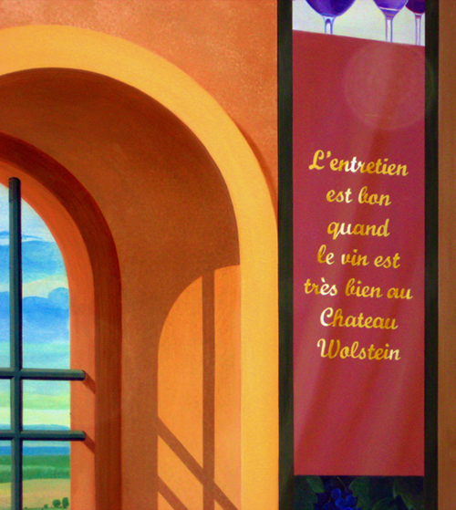
Detail of banner painting progression. An inscription was painted in gold letters. Wine-themed images were added to the top and bottom. |
However, I made my first compositional change by reducing the width of the windows to accommodate the top cabinet. Then, on the right side of the mural I added a design element to counter-balance the cabinet on the left: a hanging banner. Notice that the banner positioned on the top right is the exact size as the cabinet at the top left. This brought back a certain balance to the upper half of the composition. At this time I knew I would paint a banner but I had no idea what that banner would be. That was a thought for another time.
The bottom cabinet extended further into the mural wall than the top cabinet. To make this feature less disturbing I "raised" a wood panel on each window to the level of the counter top. Since I knew in advance that a large table would be placed at the centre of the room, I was less concerned with the lower half of the mural since this section would only be seen in part and not as a whole. So the important thing was to maintain a "horizontal" level line (more pleasant to the eye) from the counter top all the way across the composition. This visual line was later reinforced by the edged of the "tiled floor" as it receded into the landing.
|
The banner was completed with the addition of highlighed reflections on the gold letters. The source for the inscription was me. I also signed my name at the bottom edge of the banner. |
These changes took care of the "foreground" wall elements by re-establishing a degree of symmetry. But this was not enough to overcome the unbalance. I still needed to shift the "visual centre" of the composition to the right and somehow bring new harmony to the design. When balance through symmetry is not an option than the goal is to bring balance through asymmetry -a term that literally means: without symmetry. There is no simple formula to do this. It is a delicate skill where an artists' "sense of balance" comes into play (you either have it or you don't).
Attaining balance is a key human need in the physical world. Artists achieve this by "fooling" the brain. The uninformed can not always discover how this is done so I will try to describe this "psychological principle" in very simple terms. What first you have to keep in mind is that the brain can not be easily fooled -even when the eyes are! For example: a person can walk into a room, look at a painting hanging on a wall and "feel" that "something" is wrong. Figuring what that something is can be infuriating because everything looks fine to the eye but the brain does not let go. Chances are that what's wrong is that the painting is hanging slightly crooked or off centre -it is unbalanced! Some people call this as "upsetting my Karma".

|
Detail of rose-breasted grosbeak. |
So to bring Karma back into the composition this is what I did. I completely abandoned my original design for the background landscape. For an artist it is better to create anew than to try to fix what's clearly not working. This allows greater freedom of thought which lends itself to more creative compositions. The difficulty lies in its lack of organization. This must be overcome by careful placement of objects and the use of other organizational devices, points of interest within the composition that guide the eye of the viewer from one place to the next. The mind then tends to group all this visual elements into "unified wholes" and thus bring a sense of balance to the composition.

|
With the addition of the rose-breasted grosbeak (lower right) the "outdoor view" was almost completed. |
To bring the centre of attention to the right I added a French country town with a high tower as its focal point. The eye travels down through the tower's vertical axis and then is "guided" to the left by the lighted fork-like clearing leading to the next focal point -the wine bottle. The eye movement continues down the bottle through the dark vertical base of the table and then is pulled back to the right through the table's dark horizontal shadow by the next focal point which is the rose-breasted bird perched on a flowered branch.
Finally, to further reinforce the focal shift I "lighted" the right side of the wall (the eye is always attracted to lighter tones) and added cast shadows on the windows in a 45 degree incline directing the eye to the lower right side of the mural (and not to the opposite side with the counter cabinet). The new composition was more interesting, involved and animated. Furthermore, considering that the entrance to the space was on the wall at right angles to the mural wall, the viewer would notice less the discrepancies in the room's visual elements. Hopefully, the mural's new composition would involve the eye and the brain into a harmonious balance of line, shapes, colour and pleasant enjoyment. This was all good, except for one problem -the changes would require an additional three weeks of work and I had not factored this in the cost.
Saw dust, plaster dust, road dust, cement dust, fine dust, dust everywhere... I was fully aware that I was at a construction site. However, I have worked on construction sites before but never had I encountered so much dust as on this job. A carpentry shop had been set on a large adjacent room and so I expected sawdust. This I could cope with. But when the plasterers began to work on that section of the building, sanding drywall joints and releasing a fine powder that seeded the air like talc, and later the masons began work laying a stone and concrete veneer over the walls, I was immersed in dust.

|
I'm allergic to dust and exposure was taking a toll on me since day one. So I started taking antihistamines to relieve the symptoms but the drug made me drowsy. Drinking coffee helped conteract this side effect but my vision kept blurring. Adding to my misery was my chronic back pain. By the first week all I could think was getting out. But my only recourse was to tie my hair back, start a fresh pot of coffee, and labor on to the finish line. |
I am allergic to dust and this place was killing me. So the first order of business after the work crews left their day shift was to sweep and vacuum the area, uncover the dust-covered plastic sheathing protecting my equipment, removed the dust cover from the mural, and then wipe the painted surface with a moist cloth. Even with the dust-cover, the painting always had a fine powdering of it. Even after cleaning the area, the particles of dust in the air, continually moved around by the heating system, would over the hours settle and cover everything like a fine mist. I was constantly reaching for the water bottle to keep my throat moisten. But what the presence of dust significantly affected was my decision to paint the mural using acrylic paints instead of oils for most of the painting.
Oil paint is colour pigment floating in linseed oil. The oil takes time to dry, usually days, which allows the painter to blend colours and model paint into fine details. But while drying, the painted surface acts like a "dust magnet". And since a dust-cover cannot touch the wet surface, it is practically impossible to keep the particles of dust away wet oil paint. This is why, in a studio, artists turn their wet canvases against the wall after a painting session. It is my practice to do my under-painting using acrylic paints, which are water based pigments that consequently dry in a matter of minutes. But then I would rework the areas in detail using oil paints. But because of the dust problem, this routine was out of the question. My only recourse was to do the mural in acrylics.
I am as skilled with acrylics as with oils; each type of paint has its strengths. While oil allows for the slow build-up of jewel-like thin layers of colour, acrylics has the advantage of strong fast drying bright colours of greater opacity which necessitate less layering. A good artist makes use of these characteristics to create his visual illusion. I would have preferred to use oil colours to employ their magic on the mural. But dust would have ruined the painting. Therefore I decided to do the mural entirely with acrylics so that the day's work would be dry before the dust-cover went up (later on I was able to use oil glazes sparingly in the final phase of the painting and for the wine barrels mural).

|
Painting progression: adding glazes. The glazing process added tonal variations and deeper shadows to the foreground (compare this to the unglazed section at the top of the central arch). I almost mixed warm colors into the glaze to give the space a comfortable feel. Adding glazes is one of the most enjoyable things in painting. This is where the magic happens. |
I work in a very orderly fashion. I begin by painting what's furthest away and finish with what's closest. For this particular mural here is the progression: sky, clouds, distant mountains, hills and valleys, the French town, surrounding greenery, middle-ground vineyards, lower landing, outdoor patio, furnishings, props (the table setting and the flower urn); the foreground wall with windows and arched opening, and finally, the banner and the bird. As you may have noticed, each layer overlaps the previous. I rarely go back and rework a layer, and when I do, it's usually to simply accent a particular colour with a glaze.

|
The outdoor patio furniture and cast shadows were also glazed to complete this portion of the mural. Deeper shadows add greater contrast and depth to the painted illusion of three-dimensional space. |
My colour palette is selected before I begin painting and I stick with it. My palette choices have always been limited since I like to keep a tight colour balance on a painting. I mix and remix my limited colours to get variations in tone. However, my tones are usually on the low side of the intensity scale. I believe that a mural should blend comfortably in a space, not take it over like a billboard. I stay away from bright, glaringly saturated colours since I have discovered that, for some psychological reason, people feel on-edge when exposed to intense colours in enclosed surroundings. With this mural, my goal was to soothe and bring a pleasant feeling of calm, peace and harmony.

|
With the completion of the glazing on the right side, the mural was completed. |
I also follow this simple rule: man-made elements, such are architecture or objects, are painted in sharp detail; natural organic matter, such as trees or clouds, are done in soft, defused edges. Why? For a simple logical reason: nature moves! So for example, by slightly blurring the contours of a tree I can represent the effect of wind blowing on that tree and thus its movement. Man-made objects have a "static" quality about them. They do not move -at least in my murals! By following this simple rule, I can do a lot within a painting. The rule also dictates my painting approach. I draw man-made objects with precision; nature I draw loosely.
|
The final act was to sign the mural at the bottom edge of the banner. |
Another characteristic in my mural painting is that I do not paint a mural; rather, I repaint a mural... over and over. For example, notice how semi-transparent the layers of paint really are. Because of this quality one has to apply successive layers of paint over the same area to build up details. Now compared the same area of the mural to its finished "build up" of layers. This is why painting takes so long even if you are a fast painter. The skill of the painter is in the way he or she applies these details, making what seen in close-up is nothing more than a smudge of paint, look like tree foliage when seen from farther away. If you carefully study how masters like Goya or Rembrandt applied their details, you will immediately understand why they are considered artistic geniuses.
I also follow the rules of atmospheric perspective when painting (in addition to using 'lineal perspective' in the drawing). In 'atmospheric perspective' (also known as aerial perspective), as the distance between an object and a viewer increases, the contrast between the object and its background decreases. The contrast of any markings or details on the object also decreases. The colours of the object also become less saturated and shift towards blue. This is so because the moisture in the air scatters the light making objects look soft and blurred. Traditional Chinese painters were masters of this technique. If you are not a painter, don't worry about memorising any of this. Just remember that up-close objects look bright and sharp; far away they appear lighter, softer, and bluer than up-close.
|
|
||
|
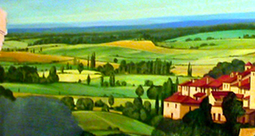
For comparison: the original conceptual design. All the basic elements in this rendering were kept in the finished mural. |
While this sounds easy to follow in theory, many painters fail to realise it in practice. Their powers of "observation" need to be improved. Then they need to apply "the rules". Many observers have praised the "atmospheric" quality of my landscapes. I wish I could take credit and claim that I'm a genius, but I'm doing nothing more than following centuries-old rules on how to achieve the effect. In fact, I learned them by reading Leonardo Da Vinci's writings on painting when I was fifteen years old and was still a year away from doing my first painting. My advice to student painters is to forget about colour and do a series of landscape exercises using only tones of grey (by simply mixing black and white) until they learn to achieve the atmospheric effect by controlling the intensity of their values. After they learn how to do this (by training their eye), then they can progress to colour and practice this new skill with greater success.

|
||
|
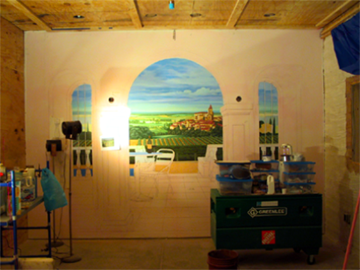
The finished mural. I completed the job before the surrounding surfaces (walls, floor, and ceiling) had been done so I did not have any visual references (lighting, textures, colors) that I could incorporate into the painting. But at the end of the day, I was pleased with the final result. |
Sometimes it boggles the mind to see how students and experienced painters spend years making the same mistakes which could have been corrected by simply reading -in a matter of minutes, how things should be done in the first place. The value of a successful painter can be measured not by the amount of work he (or she) produces, or by the prices attained by their canvases, but by how much he knows and by how much of this knowledge he applies to his craft. In a time when the ancient practice of spending years as a workshop apprentice is no longer a held tradition, learning the knowledge of the masters through reading is the only recourse to those who want to be great at painting.
Most days, by the time I arrived at the site, the day-crew had left, with the exception of a few painters who worked extra hours to catch up with the schedule. After arranging my setup for the night's task, I would prepare my first cup of coffee and sometimes go for a stroll to see what the others were doing. The woodwork at the site was fantastic and the painters were doing a phenomenal job of staining and blending plaster casts and new wood into a unified finish. I loved to see them work with the same fascination I would see an artist painting... well, a mural.
On one of these days, while I was exchanging notes with one of the painters, a gentleman came to the site and started looking around. It was not unusual to have visitors at the site, though not necessarily at that late hour. This particular gentleman was dressed in a sports coat and walked around with a pleased smile on his face. He didn't say a word and I though that perhaps he was another sub-contractor looking to see or meet with someone. Trying to be helpful, I finally asked him: -"Sir, may I help you?" He smile back and replied: -"Oh, I'm the owner". He was -of course, Mr. Scott Wolstein.
Well, I felt like an idiot. But in fact, I could not recognize him because I was not wearing glasses -again. He was just a moving blur. I mumbled something like...-"Sorry... I don't have my glasses..." (and was high on antihistamines -damned allergy!) I am seen so rarely with glasses that people do not realize how near-sighted I am. Sometimes I don't recognize people until they speak and I identify them by the tone of their voice. But Mr. Wolstein didn't seem to be much of a talker but was rather the observant type.
|
||
|
The Wolstein wine-tasting room with all the elements in place. |
This was one of many early evening visits to the site by Mr. Wolstein. He would come alone, on a few occasions in the company of guests, to look around as the work progressed or to meet with the contractor. He was still a young man, a few years older than me, though not by much, looked sharp, energetic, and fit, the way a person who practices a sport does. And he always had a great tan. I knew that he was a smart man, a demanding one who expected the best out of everyone. He had to be. You do not become one of the top CEOs in America by being a wall-flower or waiting about for things to fall on your lap.
It so happened that during the time I started the commission, I good friend of mine (and a former student), Mrs. Dolores "Dee" Begam from Beachwood, asked me what I was working on. I told her I was going to do a mural at the Wolstein estate. "You mean Scott?" -she inquired? I little surprised I answered: -"Yeah, Scott Wolstein". Then, in her oh-so-casual manner she said: -"He went to high school with my daughter Kathy; tell him I say hi." Well, Kathy's father was judge "Al" Begam. Hmm... maybe Scott remembers Kathy (I never asked him if he did).
Of what I could discern from the few times I saw him at the site, Mr. Wolstein's new place was his personal pet project. This would soon be his home, and -literally, his castle. Like most people fortunate enough to be able to build the home of their dreams, such a home is a reflection of the person. You could see the pride on his face as he toured the place. In fact, he looked the way I look when I tour one of my projects. I firmly believe that individuals with ambition that is based on the confidence of their abilities have a need to create, be it in business or in art. This is the only way to achieve a state of personal contentment -until that needs moves us foreword to the next creative spell.
|
|
Conceptual rendering for the wine cellar hallway mural. This was the next task on the list. |
There was another person I expected to see on occasion. And, to be perfectly candid, I was surprised that Mrs. Wolstein didn't visit the site as often. I never met her. Then again, I was working the late-evening and night shift so maybe she did so during the day. But still, in other jobs that I have worked in the past, the lady clients were there day or night looking at things in an almost daily basis. It's a woman thing. When I did my fiancé's place, I almost had to kick her out of her own house!
That same evening Mr. Wolstein stopped by the wine room and looked at the mural. The landscape of the French countryside was completed and so was my rendering of the medieval town of Lavardens, in Gascony (yes, it's a real place -with a restaurant inside that tower; I suggest you try a number of their more unusual dishes). I had no idea if this was the first time he was seeing the painting since I kept it covered. The base colours for the wine bottle had just dried and I was meditating on the table setup. He stood quietly in front of the mural just taking it in. I don't talk much when I paint so I didn't interrupt his reverie.
In my experience people have a similar reaction when first observing an artist at work. The ability to paint well is perceived as a gift granted to a selected few. It is seen as something special. When I tell people that I can teach them how to paint like me in six months they are astounded. "Surely you have to be born with the gift" -they say. "No" -I reply. Then I add: -"All you have to do is try it... and you will." In fact, some have taken up the challenge and have done it! But for the most part, especially in the United States, even educated and worldly people who are exposed and surrounded by art, feel somewhat intimidated about the "making of the art". This is alien territory -even mystical, so they venture into it with caution.
|
View of the hallway from the adjoining wine tasting room. Again, nothing else had been done to the space. So my first task was to wash the wall and floor and prime the wall. The hallway was very narrow that led to a walk-in cooler -actually, it was a wine storage space that had been turned into a refrigerated cooler. I transfered the design using the grid method and then I proceeded to block the spaces between the barrels. |
After a while I presented Mr. Wolstein with a challenge: -"what label should we place on the wine bottle?" Naturally, it had to be a wine of his choice. -"You pick the wine; a favourite wine." He smile and really picked on the challenge. It was not an instant decision. He turned it in his mind and then turn it some more. As he did so I smile to myself because this is the kind of involvement I want from a client to make the art come alive. From that moment on Mr. Wolstein would not look at the mural in the same way as he did before. Now it would mean something to him. This is why my interaction with the client is so important. It never fails to produce a priceless moment like this one.
Finally, he decided on a label: Château Lafite-Rothschild -one of the best French Burgundy wines in the world. I'm not a wine person, but because of my encounters with clients who are wine connoisseurs, some of their wine knowledge has rubbed on me. I have in fact tried this magnificent wine, but at two-hundred and fifty dollars a bottle (or way more) this luxury is way out of my league. Perhaps I should be thankful that I rarely consume alcohol -and this I only do when playing a social role. But considering that my fiancé is a chef that relishes the joys of fine dinning, I might get to show off my knowledge of wines more often.

|
Because of the confined space, the wine barrels were going to be seen upclose. Perspective was kept simple with little variation between barrels. Some of the barrels were going to be named, so I added the names on masking tape to identify the corresponding barrels. |
After settling the brand of the wine, we needed to select the wine's vintage (the specific year the grapes for making the wine were picked). The response from Mr. Wolstein was more spontaneous: "1970". I could not recall that year as being one of the top vintage years for Château Lafite-Rothschild (my mind stores a lot of useless facts). So I asked him why he picked nineteen seventy. He smile and declared -"That's when I graduated high school." I smiled back; this had been indeed a vintage year in his life. "Then, by Friday, I will have your bottle of Château Lafite-Rothschild 1970 waiting for you on this table."He smile back and left with a sparkle in his eye. A few days later the bottle was completed, and for good measure, I added a plate of cold cuts and cheeses!
Standing for hours on one spot was painful. The last month before completing the main mural I was working 12 to 14 hour days to make up for the additional time required to do the changes on the original design. Suffering from chronic back pain is a really annoying condition. Painting the lower section of the mural was agony. At most I could paint for five minutes before taking a minute break to stretch. My kneeling foam pad was a godsend. But the lower I have to bend, the worst the pain got. This was especially troublesome when I needed to keep a steady hand.
Another problem was lighting. To avoid reflections I light my walls at 45 degree angles. But I was painting in what amounted to an enclosed box. I could not use strong general lighting because of the glare, so I basically used spotlights aimed at whatever section I was working on. My two spotlights -Cindy and Mindy, have been with me for thirty years. When I first migrated to the United States I had no money for a lighting kit. So I made my own. When I was about fourteen years old I studied an old US Army World Wall II manual for putting on shows on the field. It had diagrams for making improvised lighting using paint cans and the like. I used this practical knowledge when doing theatre in Puerto Rico, and then to construct the spotlights.
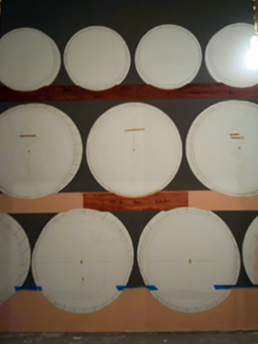
|
Next I blocked the wooden support beams with a water-base paint. After a 24-hour drying time I began faux painting wood grain on each section. This was done using artists' oils and painting medium of linseed oil, turpentine, and cobalt drier. |
My own contribution to the design was to set the lamps on telescopic microphone stands. With a 100 or 150 watt floodlights, they do the job well and are very sturdy. By the way, I named the spotlights after a couple of twins I used to know. They were as hot as the lamps. In addition to Cindy and Mindy I have other lighting equipment to fit various situations. But for this particular job, nothing seemed adequate. The room had one high window where natural light entered during daytime, and except for a large temporary mercury-vapor lamp set up by the contractor, none of the lights fixtures had been installed in the room. However, I could not take advantage of the mercury-vapor lamp because it made everything look blue and purple.
Now, what to do about the banner? While I completed most of the mural, I left the space destined to become the banner empty. I knew all along that I would paint "some kind of banner" but what kind of banner it would turn out to be was anyone's guess. After completing the basecoats for the foreground, I finally had to deal with the issue. To begin with, since this was a mural about wine the banner's theme should follow suit. This was a no-brainer. I've learn from my research that banners are a part of many wine-tasting competitions, but I did not want to copy any of them. I wanted something original.

|
I wood grain every other block. The reason was this is that, in real life, each horizontal beam supporting the barrels is made up of individual blocks, one for each barrel. So in order to give each block its own woodgrain-look, I painted each segment separately and allowed the paint to dry. To do the wood graining properly you paint beyond the finished line and then wipe the excess paint with a cloth at the cutting point. After the textured sections have dried, you wood grain the blocks in between in a slightly different grain variation. But when you extend the graining paint beyond the ends, you can wipe off the excess on the adjoining blocks without fear of ruining their finish -because they have already dried. |
My solution was to paint a banner with a gilded inscription at the centre between two motifs. For the top motif I painted glasses with several kinds of wine, and for the bottom motif I painted grapes. A selected a rich Burgundy red as the field colour for the inscription in order to better attract the eye. But I kept the colour subdued so that it would not to be too obtrusive for the rest of the mural. The design was created to scale in Photoshop, printed and then projected unto the wall. Notice the paper print taped to the wall in one of the photos. After the banner was painted, I projected the inscription and traced each letter with a white crayon pencil. This was the ideal method for positioning and then tracing the letters.
Coming up with the inscription took me a few days. I wanted to be something that would further personalize the mural to the site. Should it be written in English or French? I settled for the French because, after all, France is the setting for the mural. Also, it would make people wonder what it said and thus create interest. Lucky for you -my dear readers, unless you are Francophone, I will tell you what it means: -"L'entretien est bon quand le vin est très bien au Château Wolstein" -The entertainment (or camaraderie) is good when the wine is very good (or first-rate) at Château Wolstein. One final observation of interest: if you look at the bottom of the grapes motif in the banner, you will notice an inscription. It includes my name, and the web link to muralmaster.

|
Applying basecoat of paint to the barrels. The pencil drawing had been secured with a brown permanent marker to make it easier to see. Then the base paint was applied thin so the drawing could show through. The selection for the color of the base coat depends on the type of woodgraining being done. |
The last stage of the work was painting the foreground. I had applied the underpainting in three flat tones: the base colour, shadows and cast shadow areas and areas with light. Then I applied some texturing (notice the wall texture surrounding the arched window in one of the photos). What was left was the most important part of the painting: applying dark glazing to accent shadows and achieve tonal variation. I wanted to do them in oils because it's the best way to do them. But I was still mindful of the dust problem.

|
My disposable painting pallete with paint mix, brush and container of oil medium used for wood graining. |
I waited for the weekend since the place would be empty of workers. On Friday night I cleaned the entire area and on Saturday I did all the glazings. I mixed a drying additive into my glazing oil so that the painting would be dry by Sunday. Then I concealed the mural again under the dust-cover. I worked really fast using decorator's (house painting) brushes and a dry cloth to control the intensity of the glaze and thus provide subtle transition between lights and darks. Finally I reworked with greater care some of the cast-shadows and minor details.

|
The barrel covers were textured next. Oil paint is thinly applied, brushed smooth in the direction of the grain, and then the graining is done using a combination of brushes, cardboard and my fingers. Lastly, the excess paint around the edges is wiped clean. I used reference images to get the wood grain right. |
The final piece of the painting was adding the Rose-breasted Grosbeak (Cardinal à poitrine rose), a small singing bird related to the Cardinal. The Grosbeak is considered a North American species, but there are recorded reports of rare appearances of the bird in France and other parts of Europe. I enjoy the musical quality of its song but the reason for its rendering was the red coloration of its feathers. Red is a colour that attracts the eye. Therefore, I used this quality to complete the scheme I explained earlier for the asymmetrical design of the mural. With the completion of this bird I declared the mural done. I was exactly three weeks overscheduled.

|
I used reference images to get the wood grain right. Notice how, by using two different color base coats, I got completely different results on the barrel covers and on the wooden blocks. |
At this point I notified the designer, arranged for a meeting, and during this meeting discussed the additional work done. I wanted to be compensated for the time since I felt that had not been my fault. Understanding that designers also have budgets, I provided two posible options: a fee for the three extra weeks of work, or a reduction of three weeks from the "wine barrel mural". At first there seem to be no problem (my fees are very reasonable); all I needed to do was send an invoice. But then the bean counters got into the act and stated that I was contracted to do a mural, regardless of changes, and that was that. Okay by me; I ended up taking the time off the next mural -a pity, as you will see.

|
A section of completed barrels. The entire process is very simple, but the effect is quite striking. Note: these images were taken using bright floodlights. The colors are more subdue in normal lighting conditions. |
After completing the main mural inside the wine tasting room, I took two weeks off to attend to other business. I had wanted to start right away with the hallway murals, but the walls were not finished. Two weeks later the walls were still not done, so I began to place markings on the hallway's ceiling -to speed things along. During the next few days the surrounding walls were finished and primed, with the exception of an access panel to a water pump for a glass-waterfall that was being installed on the other side of the wall.
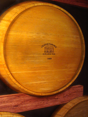
|
I added trademarks from some of the world's most prestigious wineries to a row of barrels. These trademarks are usually burned into the wood. The trademarks are an interesting detail that add to the illusion of having the most expensive wines and vintages in your wine cellar. |
Doing the "wine barrel" murals was the part of the commission that had interested me the most. This was so because I had never painted anything like it; I welcomed the novelty of it. Several ideas to improve on the design had been swimming in my head. I always gave the client what I promised, but then I would add my own signature touches to the piece. However, since I had to cut three weeks off from the time budgeted for these murals I was forced to forgo those ideas -which I will disclose later on. Instead, I simply stuck to the letter of the contract and did not deliver my signature touches. Let me say it one more time: -"A real pity".
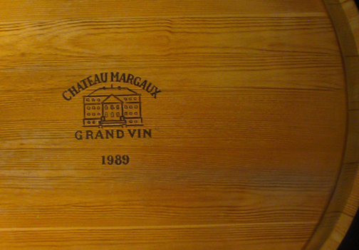
|
Detail of a winery trademarks (selected by the client). Notice the color variation of the wood. This detail was taken from photographic references of wine barrels. |
The first thing I considered in designing these murals was the narrowness of the hallway. Clearly this was going to be an "in your face" type of painting where the viewer is so close to the wall as to invalidate perspective tricks (which requires some distance between the wall and the viewer). The best point of view was going to be from the inside of the wine cellar, where the door opening was set right in the middle of the opposite wall. So this became the centre of the composition with very little optical perspective, just enough to give the impression of three-dimensionality whenever the viewer turned its head to the right or to the left. Still, because of the way the painting was designed, just showing the wine barrel tops coming out of the dark, the scheme proved extremely effective.

|
This is a view of the wine cellar mural from inside the cold-storage room. At the time, other than the addition of stone veneers to the walls, the room had not been worked on. Notice the effect of natural light coming from the adjoining wine tasting room. |
The design was worked out directly on the wall with the use of charcoal sticks, line string (attached to the vanishing point at the centre of the composition), and a compass. A basic grid was done for accuracy. The barrels were drawn to actual size and their placement was copied from photographic references of European wine cellars. After I finished with the drawing I dusted off the charcoal markings and the now faint outlines were re-rendered with a permanent brown marker. Next I applied a dark neutral base colour in the negative spaces around the barrels and a light flat earth tone on all the "rough wood" sections of the paintings. Then I began "wood graining" the wooden beams, blocks and crosspieces.
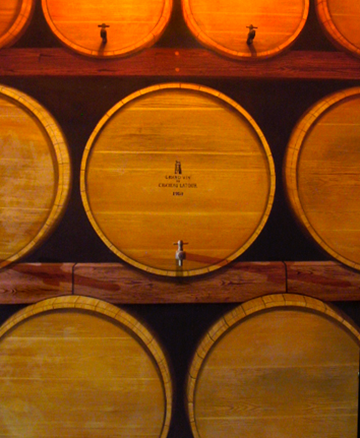
|
Real wooden spigots (taps) were added to the barrels. This detail fooled viewers entering the hallway into thinking the barrels were real. Then they did a double take when they later realized the barrels were actually a painted illusion. |
This time I was able to use oil paints (the plasterers had finally completed that section of the building). Still, I added 'Japan Dryer' to the paint to speed up drying time. I used 'painters tape' to outline a section, do the wood grain, and continue the process alternating sections. When the paint dried, I then taped the remaining sections and work on them. Alternating sections was done because of the particulars of the wood graining process where one uses different instruments to create the grain. You simply cannot stop on a precise contour line; you continue the graining process right over part of the tape. This practice also made sure that each section looked different since the grains did not match from one "wood piece" to the next. I wiped clean any excess paint with a cotton cloth.
|
|
Conceptual design of large wine barrels. At the time I did I had no idea what the room behind the door was going to be. So I rendered an elaborate wooden door (and the wine barrels) using photographic references for occuracy. |
I would take, for example, a piece of cardboard and scrape the painted surface with it. What remained looked like wood grain. Then I made adjustments with a brush, my fingers, and other pieces of cardboard rocking them with each pass to create different effects. It takes practice -and your fingertips suffer. After I was satisfied with a section, I soften the grains by making a one-directional pass with a large soft-bristle brush. If I felt that the results were not good, I would simply scrub some more paint on the entire section and begin the process anew.
I repeated the wood graining technique on the wine barrels as well. But before doing the wood graining, I painted them with a yellowish base coat. Even after covering the marker outline, it was still noticeable after the paint dried. Choosing the right colour for the base coat is important because the thin, semi-transparent layer of oil paint used for the wood graining does not cover the base coat; it stains it. It is possible to do the exact grain pattern over two surfaces but, by changing the colour of the base coat, end up with two completely different looks. So to get it right I did a few tests on a piece of plywood.
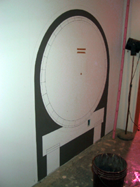
|
Completed drawing of one of the large wine barrels. |
The images on this page show how the barrels were done. I scrubbed several colours into the mix to show wood "discoloration" on the final effect. This time around I did not apply tape around the edge of the covers; this works well with straight edges but it is not very practical with round shapes. Instead I painted over the outlines and then cleaned the edges with a cotton cloth lightly moisten in turpentine. I also changed the pattern of the wood grain to simulate oak, the wood of wine barrels. However, I never tried to make a perfect copy of the real thing, only an approximation. In fact, I slightly exaggerated the intensity of the grain to make the overall work more painterly and visible under the dim lights of the hallway.

|
Large wine barrel and surrounding wall completed. |
One by one each barrel was completed -twenty one barrels in all. But there was something about repeating the process that made me want to bang my head against the wall. I couldn't wait to finish the damn thing. It felt like I would never be done. I have a problem with repeating myself. Perhaps this is why I hate acting in long theatre runs. After I did one or two I wanted to stop; the challenge was over. I was grateful that Jerry would stop by while making his rounds and save my sanity with one of his amusing stories, especially the ones about his many ex-wives! Now really, can you tell this man is in his seventies?!! Now here's the kicker: he might get married again! Jerry you are my hero -and a far better man than I will ever be.

|
Detail of right-side wine barrel with spigot added. The painting is simple but the 3D effect is very effective. |
After completing the barrels I painted the remaining wall and ceiling in a generic sandstone pattern. Then I went back and glazed shadows on the barrels, darkened the negative areas, and added trademark brandings to a row of barrels. They represent five of the top wine makers in the world. Not only that, Mr. Wolstein selected the brands himself. I had asked the designer to ask him for a list during the early design process. Then I researched the trademarks and the vintage year of some of their best wines. I think the final result was a nice touch.

|
Detail of left-side wine barrel. I made sure that the electrical box was positioned on the wooden block. |
Another of my suggestions was to get two real spigots and add them to the large tavern barrels. The designer liked the idea and ordered them for me. When they arrived I sent them to a wood shop so that they could be trimmed to size (giving the impression they had been pounded into the barrels) and so that a toggle bolt and plug could be added to secure them in place. But before final installation, I "distress them" (so they looked used), matched the colour, and painted a cast shadow on each barrel. After seeing them, Mr. Wolstein requested spigots on all the barrels.

|
The surrounding hallway walls were painted to simulate sandstone blocks. This photo was taken under strong lights so the color looks much lighter then normal. |
I completed the wine barrel murals during the summer and was off to another project which I had started a few weeks before. I never got to see the finished rooms fore these would take months to be completed. I did see the lighting on the hallway when I return a couple of months later to add the additional spigots on the rest of the barrels. Even though I was done with the job, I felt it was not complete. I always like to match the tones in my murals with their surroundings. With the addition of a few glazes one picks up tones from the floor, furnishings and walls to balance the look of the entire space into a more unified composition. And with the actual light fixtures in place, shadows are corrected and the contrast is brought to balance.

|
I signed the wine barrel murals on one of the beams: "John Rivera-Resto 7-2007". It would take another couple of weeks for the murals to properly dry before I could remove the dust covers and remove my kit. |
Though I was grateful to the designers and for the opportunity to do the job, I felt disconnected from the process. As I have observed before, many artists would have been delighted with such a chance to practice their craft. But my craft is more about satisfaction. If I feel that I have let the client down than I have failed to satisfy myself. There is no denying that these are all personal reasons which pertain only to me. But it is because I have my own defined criteria that my work is not like that of any other artist. This is called "taste".
|
The thing about painting murals is that after I'm done with a job, I'm left too exhausted to enjoy the results. All I want to do is anything else but paint. But then... the phone rings. I completed the The Wolstein Château Wine Room Murals in August 2007 and immediately moved on to my next commission -the Waste Management Office Mural. |
Still, I knew the artwork was good even if I had to let go some of my ideas on the wine barrel murals. What were these ideas? Three things: firstly, I would have painted two imperial logos on the large tavern barrels -one for Imperial Rome and one for the Royal Court of Byzantium. Historically there were legendary wines which do not exist anymore because their vineyards were destroyed in ancient times. But these wines are mentioned by classical writers. I figured it would have been one hell of a conversation piece if Mr. Wolstein possessed the only remaining samples of such wines in his wine cellar.
Secondly, I would have dedicated more time to the painting of the walls and added a vineyard motif to the ceiling or possibly a few wine making accoutrements hanging from the beams. And thirdly, I would have painted, over the door's threshold, a marble carving of Dionysus, the god of wine and inspired madness, which represented not only the intoxicating power of wine, but also its social and beneficial influences. Perhaps I may still realise these ideas and explore new ones in another job. It is true that murals are only paint, but it is paint shaped to give the illusion of something special and unique. Creating illusions for the pleasure of others is the magic of the muralist when opportunity comes knocking. And if there is one thing I have learned in my profession is that one never knows what the next day may bring, except that it will bring something. So I just play it by ear... but for now, I'm done!